|
[#1]
Quoted: Quoted: CDC Obesity Map http://www.cdc.gov/obesity/images/map_county_obese_2007.jpg CDC Diabetes Map http://www.cdc.gov/obesity/images/map_county_diabetes_2007.jpg Foodstamp Map http://www.peopleofwelfare.com/wp-content/uploads/2010/03/foodstampmap.jpg Beat me to it. Funny how those unable to make life choices that put food on the table are also unable to make healthy choices. They load up on mostly cheap carbs and processed foods with their food stamps.  The sick thing is these cheap processed foods they purchase are primarily made of corn or soy and their various byproducts. Foods which the government subsidizes in order to hide the true cost of food production from the American people. Not only are we paying the poor to eat. We are paying out the ass in order to make the unhealthy foods which these people eat appear to be far cheaper than they really are. Which only encourages these people to eat even more of the stuff which is bad for them because they think it's all they can afford with our money. The sick thing is these cheap processed foods they purchase are primarily made of corn or soy and their various byproducts. Foods which the government subsidizes in order to hide the true cost of food production from the American people. Not only are we paying the poor to eat. We are paying out the ass in order to make the unhealthy foods which these people eat appear to be far cheaper than they really are. Which only encourages these people to eat even more of the stuff which is bad for them because they think it's all they can afford with our money.
|
|
|
|
[#2]
Quoted:
Quoted:
I guess the south is all about freedom...and foodstamps I think you may be missing something else that the south has a lot more of than northern or mid western states. I'm not I see what your saying:) |
|
|
|
[#3]
Damn. That is an interesting map right there.
|
|
|
|
[#4]
How is that "Hope and Change" working out? Please see map at beginning of thread.
|
|
|
|
[#5]
Quoted:
Looking at my state the blue areas are the ones that are either reservations or have a fairly substantial population of the type of people that live on reservations. I'll just leave it at that. Exactly this.
|
|
|
|
[#6]
Quoted:
Quoted:
Quoted:
CDC Obesity Map http://www.cdc.gov/obesity/images/map_county_obese_2007.jpg CDC Diabetes Map http://www.cdc.gov/obesity/images/map_county_diabetes_2007.jpg Foodstamp Map http://www.peopleofwelfare.com/wp-content/uploads/2010/03/foodstampmap.jpg Beat me to it. Funny how those unable to make life choices that put food on the table are also unable to make healthy choices. They load up on mostly cheap carbs and processed foods with their food stamps. The sick thing is these cheap processed foods they purchase are primarily made of corn or soy and their various byproducts. Foods which the government subsidizes in order to hide the true cost of food production from the American people. Not only are we paying the poor to eat. We are paying out the ass in order to make the unhealthy foods which these people eat appear to be far cheaper than they really are. Which only encourages these people to eat even more of the stuff which is bad for them because they think it's all they can afford with our money. What? No? Grains are bad? No way, you are crazy. God gave us grain and the indians gave us corn and we are better for it. Civilization itself is because of the growing grains and starchy foods like potatoes. And what about BEER!?!?!?!?! ...That is the reaction I get when I try and explain that to people. I am sure you get it too. Some people are getting it though. I had one friend who was suffering rashes and obesity his entire life get relief and lost a bunch of weight just by changing his diet. He looks 1000x more worthy of his hot wife now. Growing up, my Mom would say that all of our ills were because of "white food" (meaning the "White" diet, we're native) yet still feed us all the same shit she said was making us sick and our teeth fall out. Seems like people would rather buy a pill or buy into a diet that sells them stuff rather than just cut out starchy shit. It is pretty damn simple. Maybe too simple. And the kicker is that it isn't that much difference in cost. You look at cereal and it is $5 a pound or more. Same with bread. I can get a damn nice cut of beef for $5 a pound or several pounds of burger, but noooooo, we have all been told forever that that will kill you and that cows are killing the planet. Bacon, eggs, cheese, all cost about the same as processed grain based foods, and when you start figuring calories per dollar they are cheaper most of the time. |
|
|
|
[#7]
I'm not surprised about Louisiana's color. My mom was in public health before she retired & she said that they put out in the conferences that 50% of Louisiana's population was on some form of federal assistance.

|
|
|
|
[#8]
Quoted:
I'm not surprised about Louisiana's color. My mom was in public health before she retired & she said that they put out in the conferences that 50% of Louisiana's population was on some form of federal assistance. When I lived in TX I went there a few times and it looked pretty rough. |
|
|
|
[#9]
Quoted:
Foodstamp Map http://www.peopleofwelfare.com/wp-content/uploads/2010/03/foodstampmap.jpg ETA: Alternate link to same data for people who believe the host site corrupts the validity of the map. link Looks about right based on the places I've lived. |
|
|
|
[#10]
Obese people are getting free food !
|
|
|
|
[#11]

That map shows that California issues out very few food stamps and the conventional knowledge here is that California is the only state in the union issuing food stamps. |
|
|
|
[#12]
Quoted:
That map shows that California issues out very few food stamps and the conventional knowledge here is that California is the only state in the union issuing food stamps. Actually, California has 5x as many people on food stamps as Mississippi. |
|
|
|
[#13]
People are easily duped...
Unfortunately there are several huge, gaping issues with this map that are distorting things. The biggest issue is that the map uses percentages of the population on a COUNTY-BY-COUNTY BASIS instead of doing it as a percent of...say...population density per square mile, or something like that. Many people are commenting on Alaska –– this is a fantastic example: Take a look at this list of counties and census areas in Alaska.. The dark blue areas on the NY times map of food stamps encompass 240,000 square miles –– larger than 48 of the 50 states yet has a population of only 47,551 (using the numbers from the map, apparently 2009 data). Out of those, 16,775 are on food stamps. Yet the area shaded for them is almost as large as Texas. Thus, every person on food stamps in those location has a huge proportional impact on the percentage of county-wide population on food stamps...especially compared to somewhere like California, which has a population of 37-million in an area 68% of the size of the aforementioned parts of Alaska... With these HUGE areas and counties being shaded dark blue, it really distorts the actual data, and makes Alaska look terrible. Alaska Population Density Per Square Mile 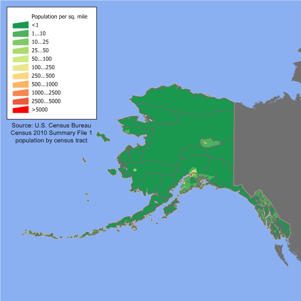
Size of Alaska vs. the Lower 48: 
Using the spreadsheet used to make the map, Alaska has 69,000 people on foodstamps, while California has 2.8-million. On the other hand, that is ~10% of Alaska, and ~7.5% of California. Mississippi has 510,000 people on food stamps out of 2.9-million, or 17.6%. Don't forget, however, that California's population on food stamps is approximately equal to the entire population of Mississippi. It can be pretty easy to screw around with data if you want. A few people mentioned Oregon and Maine, too...glance at the food stamp map, then at these population density maps. The huge blue areas on the food stamp map aren't really representative of what's going on. Oregon Population Density Per Square Mile: 
Maine Population Density Per Square Mile: 
Certainly, there are social and cultural issues involved as well. But don't let the map distortions screw up your perception of things. I'm definitely not defending those on the dole, but I also don't want people thinking the entire population of Alaska, Maine, or Oregon receive food stamps due to a crappy map and not looking at the provided data. 
|
|
|
|
[#14]
Quoted: I guess the south is all about freedom...and foodstamps OH SNAP! |
|
|
|
[#15]
Quoted:
... The idea of using per capita data isn't exactly new. I realize it threw a few people in the thread for a loop but I'm under the impression that most people understand this way of presenting data and are aware of it's limitations. Sometimes voting maps are done this way. I'm a GISP but I still give the average reader the benefit of the doubt when I estimate their ability to understand fundamental concepts related to map data. |
|
|
|
[#16]
Quoted:
Something I wanted you guys to compare to once the thread got some hits. I don't know the nature of the relationship but from a spatial correlation standpoint it's interesting to me. CDC Obesity Map http://www.cdc.gov/obesity/images/map_county_obese_2007.jpg CDC Diabetes Map http://www.cdc.gov/obesity/images/map_county_diabetes_2007.jpg Foodstamp Map http://www.peopleofwelfare.com/wp-content/uploads/2010/03/foodstampmap.jpg FUCKEN LIEBERAL STATES |
|
|
|
[#17]
Quoted: Quoted: Quoted: the map of Alaska is kinda surprising Why? Posted Via AR15.Com Mobile large section in the middle of the state has over 50% on food stamps. That kinda surprised me for a state with a reputation of rugged self-sufficiency Please, those Eskimos would be eating each other if it weren't for Uncle Sam's magic tit. |
|
|
|
[#18]
Quoted:
Quoted:
... The idea of using per capita data isn't exactly new. I realize it threw a few people in the thread for a loop but I'm under the impression that most people understand this way pf presenting data and are aware of it's limitations. Sometimes voting maps are done this way. I'm a GISP or work with GIS professionally but I still give the average reader the benefit of the doubt when I estimate their ability to understand fundamental concepts related to map data. True...I just hate it when data is distorted so much. |
|
|
|
[#19]
Maps showing divorce rate/teen pregnancy rates show a strong similarity to the other maps.
|
|
|
|
[#20]
Quoted:
Quoted:
Quoted:
... The idea of using per capita data isn't exactly new. I realize it threw a few people in the thread for a loop but I'm under the impression that most people understand this way pf presenting data and are aware of it's limitations. Sometimes voting maps are done this way. I'm a GISP or work with GIS professionally but I still give the average reader the benefit of the doubt when I estimate their ability to understand fundamental concepts related to map data. True...I just hate it when data is distorted so much. I don't like misrepresentation either but I think it's a type of presentation, not distortion. Say you were looking at your county wondering how many of your fellow county residents were on the foodstamp dole. Per capita is a nice way to see that because if you were in a less densely populated county, your stats are not "distorted" by large population centers. You can get a quick sense of percent and get a feel for how many mouths your tax dollars are feeding in your area. Actual numbers would be hard to show without zooming in and they could be deceiving too because many foodstamp recipients in major urban areas might come with many people no receiving foodstamps, diluting the folks on the dole if you will. Every way has its flaws I guess. |
|
|
|
[#21]
In WY, MT, ND, SD all of the dark blue counties are Indian Reservations.
All leaching southerners need to STFU about states like CA and NY. |
|
|
|
[#22]
In WY, MT, ND, SD, AZ all of the dark blue counties are Indian Reservations.
All leaching southerners need to STFU about states like CA and NY. |
|
|
|
[#23]
Quoted: Quoted: CDC Obesity Map http://www.cdc.gov/obesity/images/map_county_obese_2007.jpg CDC Diabetes Map http://www.cdc.gov/obesity/images/map_county_diabetes_2007.jpg Foodstamp Map http://www.peopleofwelfare.com/wp-content/uploads/2010/03/foodstampmap.jpg Is everyone in Mississippi a fatass? yes |
|
|
|
[#24]
Quoted: The map is by percentage of residents. Eastern Kentucky is pretty damn sparse through the eastern counties and they are poor, so sure, 80% in a huge county might be on the dole, but the number of people that represents is trivial. For example, Estill county has about 15k people, but is over 256 sq miles... thats a lot of blue area representing very few people. Compare that with 600k people in Washington DC, which is only about 60 sq miles and would barely show up as a dot. Eastern Kentucky is dirt fucking poor... there is no explaining any way out of that. |
|
|
|
[#25]
Quoted:
In WY, MT, ND, SD, AZ all of the dark blue counties are Indian Reservations. All leaching southerners need to STFU about states like CA and NY. How do you explain Oklahoma then? |
|
|
|
[#26]
Quoted: Ummmm... the entire state is a reservation. As far as I know they have the highest native population in the country.Quoted: In WY, MT, ND, SD, AZ all of the dark blue counties are Indian Reservations. All leaching southerners need to STFU about states like CA and NY. How do you explain Oklahoma then? |
|
|
|
[#27]
Fucking Rio Grande Valley, we need to just give it back to Mexico. It's also solid Democrat. Fucking fuckers.
|
|
|
|
[#28]
Quoted: Would be interesting to see the same map with $$$ spent on foodstamps... This is what I'd like to see! or maybe not...I'd probably have to double up on my blood pressure meds
|
|
|
|
[#29]
Quoted:
Hmm...not a great correlation with income. http://www.visualizingeconomics.com/wp-content/uploads/income_map.gif According to these maps the South has the fattest, most uneducated, poorest people with the highest divorce and teen pregnancy rates. Manufacturers are going there to avoid union labor. FUCKEN UNIONS! |
|
|
|
[#30]
Quoted:
Quoted:
I guess the south is all about freedom...and foodstamps I think you may be missing something else that the south has a lot more of than northern or mid western states. I'm assuming you're talking about minorities. Perhaps you should look at the demographics of the urban midwest and northern states before you say something dumb. |
|
|
|
[#31]
Damn southern Utahns.
|
|
|
|
[#32]
Quoted:
How is that "Hope and Change" working out? Please see map at beginning of thread.  Anyone who thinks you can significantly change these statistics in 2-3 years is a moron. This is something that would take generations. Anyone who thinks you can significantly change these statistics in 2-3 years is a moron. This is something that would take generations.
|
|
|
|
[#33]
Quoted:
Quoted:
That map shows that California issues out very few food stamps and the conventional knowledge here is that California is the only state in the union issuing food stamps. Actually, California has 5x as many people on food stamps as Mississippi. Ever hear the term "per capita" ? California has 39 million people vs 2.x million in Mississippi. This means Mississippi has a far higher rate of usage. |
|
|
|
[#34]
Quoted:
Go Wisconsin! No shit. Thought my county would be particularly bad, but it's not. |
|
|
|
[#35]
A LOT of voters there
I believe Pittsburgh PA "Allegheny county" is understated on that chart |
|
|
|
[#36]
Man the more maps you post the less I consider leaving WI.
|
|
|
|
[#37]
Speaking of foodstamps...while in CO a couple weeks ago...I see an ATM. "Now accepting EBT cards"
Fucking kidding me? apparently you can take your EBT card (aka...foodstamps) and draw fucking cash against it. That's not a helping hand...that's plain and simple redistribution. |
|
|
|
[#38]
Quoted: Something I wanted you guys to compare to once the thread got some hits. I don't know the nature of the relationship but from a spatial correlation standpoint it's interesting to me. CDC Obesity Map http://www.cdc.gov/obesity/images/map_county_obese_2007.jpg CDC Diabetes Map http://www.cdc.gov/obesity/images/map_county_diabetes_2007.jpg Foodstamp Map http://www.peopleofwelfare.com/wp-content/uploads/2010/03/foodstampmap.jpg  |
|
|
|
[#39]
Look at my State........disgusting..............
|
|
|
|
[#40]
Quoted: Foodstamp Map http://www.peopleofwelfare.com/wp-content/uploads/2010/03/foodstampmap.jpg ETA: Alternate link to same data for people who believe the host site corrupts the validity of the map. link wow, interesting stuff there..... |
|
|
|
[#41]
Quoted:
Hmmmmm...... Arizona, New Mexico, and southern Texas all have one this in common... what could it be?
The cities in the southeast have one thing in common... what could it be? How does Eastern Kentucky and SE Missouri reinforce your vision - or can that be conveniently ignored in the interest of reinforcing existing viewpoints? It seems to draw a wide swath between Mexicans, Indians, rural "Whites," urban and Mississippi Delta blacks... and so on. People see what they want to see, I guess. |
|
|
|
[#42]
Quoted:
Quoted:
That map shows that California issues out very few food stamps and the conventional knowledge here is that California is the only state in the union issuing food stamps. Actually, California has 5x as many people on food stamps as Mississippi. But well over 10 times as many people.
|
|
|
|
[#43]
Quoted:
Quoted:
Quoted:
That map shows that California issues out very few food stamps and the conventional knowledge here is that California is the only state in the union issuing food stamps. Actually, California has 5x as many people on food stamps as Mississippi. But well over 10 times as many people.
They don't be teachin' any of them maths thingamajiggers down South, ya'll. |
|
|
|
[#44]
Quoted:
Speaking of foodstamps...while in CO a couple weeks ago...I see an ATM. "Now accepting EBT cards" Fucking kidding me? apparently you can take your EBT card (aka...foodstamps) and draw fucking cash against it. That's not a helping hand...that's plain and simple redistribution. Liberals are just absolutely insane. It went from "foodstamps" to just CASH and in some places they let food stamp recipients eat three meals a day at their kid's school (so why do they need food stamps? Hello!). I really hate what they've done to this country..... Apparently the same thing in CT: Get cash from your "food" card. http://www.ct.gov/dss/cwp/view.asp?a=2349&q=304628 |
|
|
|
[#45]
Quoted: Quoted: Speaking of foodstamps...while in CO a couple weeks ago...I see an ATM. "Now accepting EBT cards" Fucking kidding me? apparently you can take your EBT card (aka...foodstamps) and draw fucking cash against it. That's not a helping hand...that's plain and simple redistribution. Liberals are just absolutely insane. It went from "foodstamps" to just CASH and in some places they let food stamp recipients eat three meals a day at their kid's school (so why do they need food stamps? Hello!). I really hate what they've done to this country..... Apparently the same thing in CT: Get cash from your "food" card. http://www.ct.gov/dss/cwp/view.asp?a=2349&q=304628 Freaking disgusting...pisses me off beyond belief... |
|
|
|
[#46]
0 to 7% is pretty big percentage for the bottom rung on that scale. I would think that 7% would be a huge percentage. Is that map showing the actual percentage of the population consuming footstamps?
|
|
|
|
[#47]
Holy crap! Utah seems pretty self sufficient.
|
|
|
|
[#48]
Quoted: Ths site the OP links to is just using the NY Times map without giving the NY Times credit.Quoted: Foodstamp Map http://www.peopleofwelfare.com/wp-content/uploads/2010/03/foodstampmap.jpg ETA: Alternate link to same data for people who believe the host site corrupts the validity of the map. link Looks about right based on the places I've lived. Okay on that one you can make it only whites or only blacks. If you remove blacks the far southern states drop way down but the worst states are then Tennessee, Kentucky, West Virginia, and Missouri. |
|
|
|
[#49]
Most of the previous maps show a correlation with the Black Belt of Alabama. According to 2000 Census, the racial makeup of the Black Belt region was 52.24% African American (307,734 people) and 45.87% White (270,175 people).

The counties that went for Kerry in 2004 are shown in blue. 
|
|
|
|
[#50]
Quoted: Most of the previous maps show a correlation with the Black Belt of Alabama. According to 2000 Census, the racial makeup of the Black Belt region was 52.24% African American (307,734 people) and 45.87% White (270,175 people). http://i1012.photobucket.com/albums/af243/GunNerd64/AlabamaBlackBelt.png The counties that went for Kerry in 2004 are shown in blue. http://i1012.photobucket.com/albums/af243/GunNerd64/618px-Blue_Belt_Alabama.png If you click white only you can see the northern parts of Alabama where 20% of whites are on the dole. Marion, Franklin and Cherokee county all are around 20% Kind of interesting that in the areas where blacks have a really really high percentage the white percentage on the dole plummets.
|
|
|

AR15.COM is the world's largest firearm community and is a gathering place for firearm enthusiasts of all types.
From hunters and military members, to competition shooters and general firearm enthusiasts, we welcome anyone who values and respects the way of the firearm.

Subscribe to our monthly Newsletter to receive firearm news, product discounts from your favorite Industry Partners, and more.
Copyright © 1996-2024 AR15.COM LLC. All Rights Reserved.
Any use of this content without express written consent is prohibited.
AR15.Com reserves the right to overwrite or replace any affiliate, commercial, or monetizable links, posted by users, with our own.


