|
[#1]
Half the fun of going to Yellowstone is watching the idiots try to pet bison.
I think they should sell "Bison Treats" in the gift shops. |
|
|
|
[#2]
The sign should show bison ramming his horn up Helvetica Man's ass.
|
|
|
|
[#3]
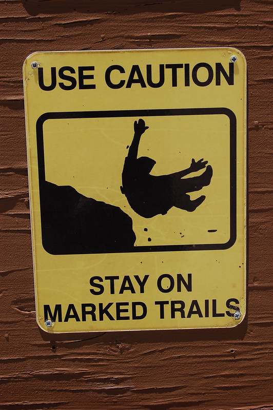
Jackson filmmaker Sava Malachowski, who has made several safety videos on topics as varied as avalanches and winter driving, believes Helvetica Man will convey his message to most Yellowstone visitors. Most visitors, but not all. “If you string enough of them side by side, someone might pay attention to them,” Malachowski said of the flyer. “They had these posters for years and it didn’t stop the last guy from being gored.” Uhm no. People are stupid and do stupid things- like try to pet wild animals or let their kid slip into the gorilla exhibit or near bodies of water in Florida. I'm actually kind of surprised more of Yellowstone isn't off-limits. |
|
|
|
[#4]
This should be the new logo for the Buffalo Bills.
|
|
|
|
[#5]
They should put up a picture of Nugent riding the Buffalo.
With a sighn saying if you can catch him you can ride-em. Park tourism would increase with people watchers waiting to see some Buffalo teaching people how to fly. |
|
|
|
[#6]
Quoted:
If you have visited Yellowstone since the 1950s you have seen the original Bison warning. It features a man being tossed by a Bison. Now the sign has been replaced with a more generic "person" who will look familiar- it is the same generic featureless person who has the worst luck. Helvetica man slips on the wet floor, gets squashed by bulldozers, swims with sharks, gets electrocuted, etc. I liked the old sign better, myself. http://www.eastidahonews.com/2016/06/new-signs-yellowstone-bison-gores-helvetica-man/ Snippet: Wilson artist Diane Benefiel offered a brief critique of the replacement of Anguished Airborne Illustrated Tourist by Helvetica Man. “The guy’s face in the original one is more effective,” she said. “He looks like he’s getting killed, fearing for his life. The other one is just kind of cold and non-emotional.” Will Yellowstone’s Helvetica Man work as a messenger? “I think we should have more blood and guts,” Benefiel said. Counterpoint: Jackson filmmaker Sava Malachowski, who has made several safety videos on topics as varied as avalanches and winter driving, believes Helvetica Man will convey his message to most Yellowstone visitors. Most visitors, but not all. “If you string enough of them side by side, someone might pay attention to them,” Malachowski said of the flyer. “They had these posters for years and it didn’t stop the last guy from being gored.” Trivial pursuit bonus: Designers Ellen Lupton and J. Abbott Miller nicknamed the figure Helvetica Man after a typeface that has a clean modern look. Swiss typeface designers created the Helvetica font in 1957. Its name came from the Helvetii tribe that occupied the alpine land now known as Switzerland before the Roman conquest in about the 2nd century BC. Now, if you have a better design to warn the 'tards to not poke the bison warm up your MS Paint and let 'er rip. I spend a lot of time outdoors and in National Parks. On a lot of forums I frequent, I keep reading how Parks budgets have been slashed, and how maintenance is sometimes YEARS behind, because their simply aren't the funds to keep up with everything that needs to be done. Why the fuck are we commissioning "artists" to replace a perfectly good sign?? I'd rather have a clean shitter and a 50 year old sign. |
|
|
|
[#7]
I ran the "employee pub" at Old Faithfull for several summers. There were always three or four old bulls that would hang out around the dorms and the pub. We had this one old guy would bet you a six pack he could pet this giant 2000lb bull. He would walk right up to the big old bull and scratch it under the chin like a dog. The bison loved it. It is a shame this was before cell phone cameras.
|
|
|
|
[#8]
A bison is something an Australian washes his face in.
|
|
|
|
[#9]
Quoted:
Park tourism would increase with people watchers waiting to see some Buffalo teaching people how to fly.  
|
|
|
|
[#10]
I was riding a motorcycle through Yellowstone last summer and there was a bison at the ticket window/entrance, standing right in the middle of the road.
I wasn't sure what do do, but the buffalo smiled at me, so I just rode past him. Several hours later, we got stuck in a big traffic jam as a herd of about 150 bison slowly crossed the road (to get to the other side). Some chick wanted to get a selfie with a buffalo, and picked the big one that was standing on the edge of the road while the rest of the herd crossed (you already know she picked the wrong one). He hooked her and tossed her 10-12 feet in the air. She left in a Medevac chopper. |
|
|
|
[#11]
This article appeared in WyoFile. Diane was quoted as saying "I think there should be more blood and guts". I think that graphic photos of the aftermath of a goring would be best. |
|
|
|
[#12]
Quoted: A bison is something an Australian washes his face in.  |
|
|
|
[#13]
When we were kids we used to feed the bears marshmallows from the car window. Sure glad there weren't signs about that...
|
|
|
|
[#14]
|
|
|
|
[#15]
Quoted:
When we were kids we used to feed the bears marshmallows from the car window. Sure glad there weren't signs about that... I fed them peanut butter/jelly sandwiches because Yogi/Boo-Boo. In return, I got covered from head to foot with thick, sticky bear slobber. |
|
|
|
[#16]
Quoted: I ran the "employee pub" at Old Faithfull for several summers. There were always three or four old bulls that would hang out around the dorms and the pub. We had this one old guy would bet you a six pack he could pet this giant 2000lb bull. He would walk right up to the big old bull and scratch it under the chin like a dog. The bison loved it. It is a shame this was before cell phone cameras. |
|
|
|
[#17]
They should have a photography contest each year. Best selfie with a buffalo. Best family selfie with a buffalo. Best selfie with the herd. Farthest inside a car a buffalo sticks it's head.
|
|
|
|
[#18]
Quoted:
This article appeared in WyoFile. Diane was quoted as saying "I think there should be more blood and guts". I think that graphic photos of the aftermath of a goring would be best. There is an orangutan sanctuary outside of Kuching, Sarawak in Malaysia where you wander around with a couple of guides and watch the orangutans in the trees and getting fed. Before you enter you have to sign a waiver then sit through a small informative lecture about the animals, their habitat, etc. After that they tell you to listen to the guides and never get near the animals, especially mothers with young. One of the guides shows off his mangled hand where he lost a finger and part of another getting a smaller orangutan off a visitor who got too close. There are also large warning signs with graphic pictures, not drawings, of mauled hands, limbs, etc. Despite all of this, as we’re watching the critters, a mother with her young swings overhead and the Dutch tourists start trying to get closer for better pictures. All the while the park rangers/guides are trying their best to get everyone to move away without upsetting the animals. The same Dutch that had just sat through the same thing I had not ten minutes earlier and seen the mangled hand and gory pictures are now trying to get close to 80lbs of muscle with a baby. People are often just stupid. 
|
|
|
|
[#19]
Quoted:
There is an orangutan sanctuary outside of Kuching, Sarawak in Malaysia where you wander around with a couple of guides and watch the orangutans in the trees and getting fed. Before you enter you have to sign a waiver then sit through a small informative lecture about the animals, their habitat, etc. After that they tell you to listen to the guides and never get near the animals, especially mothers with young. One of the guides shows off his mangled hand where he lost a finger and part of another getting a smaller orangutan off a visitor who got too close. There are also large warning signs with graphic pictures, not drawings, of mauled hands, limbs, etc. Despite all of this, as we’re watching the critters, a mother with her young swings overhead and the Dutch tourists start trying to get closer for better pictures. All the while the park rangers/guides are trying their best to get everyone to move away without upsetting the animals. The same Dutch that had just sat through the same thing I had not ten minutes earlier and seen the mangled hand and gory pictures are now trying to get close to 80lbs of muscle with a baby. People are often just stupid.
Quoted:
Quoted:
This article appeared in WyoFile. Diane was quoted as saying "I think there should be more blood and guts". I think that graphic photos of the aftermath of a goring would be best. There is an orangutan sanctuary outside of Kuching, Sarawak in Malaysia where you wander around with a couple of guides and watch the orangutans in the trees and getting fed. Before you enter you have to sign a waiver then sit through a small informative lecture about the animals, their habitat, etc. After that they tell you to listen to the guides and never get near the animals, especially mothers with young. One of the guides shows off his mangled hand where he lost a finger and part of another getting a smaller orangutan off a visitor who got too close. There are also large warning signs with graphic pictures, not drawings, of mauled hands, limbs, etc. Despite all of this, as we’re watching the critters, a mother with her young swings overhead and the Dutch tourists start trying to get closer for better pictures. All the while the park rangers/guides are trying their best to get everyone to move away without upsetting the animals. The same Dutch that had just sat through the same thing I had not ten minutes earlier and seen the mangled hand and gory pictures are now trying to get close to 80lbs of muscle with a baby. People are often just stupid.
People, including my sister, are fucking stupid. In Africa we were at a lodge famous for animals coming up and feeding on the lawn at night. We sat in the cabin and watched buffalo, hippo and a lot of others for hours. about 2 am we are awoken by yelling. "Ma'am, get back in your cabin!" "I'm from fucking Montana and we have grizzlies! I'm not afraid of your animals!" "Ma'am, there are lions in the shadows, please get back in your cabin!" I look out the window and my fucking stupid sister is walking on the lawn. The armed guards won't even leave the main building to get her back to her cabin. I yell out the door for her to get the fuck back into her cabin and she turns around and heads in. As we watch her I can see the lions working the shadows. You can't fix stupid! |
|
|
|
[#20]
|
|
|
|
[#21]
Quoted:
I would have loved to see that. Quoted:
Quoted:
I ran the "employee pub" at Old Faithfull for several summers. There were always three or four old bulls that would hang out around the dorms and the pub. We had this one old guy would bet you a six pack he could pet this giant 2000lb bull. He would walk right up to the big old bull and scratch it under the chin like a dog. The bison loved it. It is a shame this was before cell phone cameras. What changed between the time you read his post and made your post? Grammatik macht Frei! 

|
|
|
|
[#22]
Sign needs to be in Mandarin. |
|
|
|
[#23]
Hell yah! Man on a freakin buffalo don't gaf about your sign! |
|
|
|
[#24]
.
Looks to me like somebody at DOI got their artist friend a cool paycheck. I wonder if there is a royalty clause based on the number of reproductions of the image in the contract? |
|
|
|
[#25]
 |
|
|
|
[#26]
Most of the larger NPS sites have an Artist in Residence program where an artist gets room and board, maybe a vehicle for a few months in exchange for a piece of artwork. The park my pay then sell it, sell prints, make tshirts out of it, etc. Maybe Helvetica man is a postmodern take on something or other??? |
|
|
|
[#27]
Quoted:
This should be the new logo for the Buffalo Bills.
|
|
|
 Win a FREE Membership!
Sign up for the ARFCOM weekly newsletter and be entered to win a free ARFCOM membership. One new winner* is announced every week!
You will receive an email every Friday morning featuring the latest chatter from the hottest topics, breaking news surrounding legislation, as well as exclusive deals only available to ARFCOM email subscribers.

AR15.COM is the world's largest firearm community and is a gathering place for firearm enthusiasts of all types.
From hunters and military members, to competition shooters and general firearm enthusiasts, we welcome anyone who values and respects the way of the firearm.

Subscribe to our monthly Newsletter to receive firearm news, product discounts from your favorite Industry Partners, and more.
Copyright © 1996-2024 AR15.COM LLC. All Rights Reserved.
Any use of this content without express written consent is prohibited.
AR15.Com reserves the right to overwrite or replace any affiliate, commercial, or monetizable links, posted by users, with our own.