|
Posted: 12/1/2016 4:31:26 AM EDT
[Last Edit: GoatBoy]
Welcome To The New AR15.Com! A quick welcome message and link to the mini "tour" article. It has taken longer than we had hoped to bring to life, but we think it will be well worth the wait! Read Full Article »Quick Help Guide A mini-tour of the new site's layout and locations for all the key features. Read Full Article »Please take a minute to check out the welcome post along with a quick help/tour of the main layout changes. Remember that we will continue to work on things, so be patient and give things a chance. There may be things you love and things you hate, and I'll listen to all feedback and ideas. Just try to word it in a polite manner. |
|
|
|
|
[#1]
Something must be wrong with my work browser (MSIE11).
There is a lot of wasted, empty space all around the posts. The avatars are bigger. In the reply box I can only see the tweet, amazon, font size, split quote, insert spoiler box, code buttons. I'm willing to ride this out as I'm sure GB will make it right (assuming what I'm seeing is wrong). The addition of adding media without having to link from an external site is probably the biggest thing that I've been wanting. Test Test |
|
|
|
AL, USA
|
[#2]
Originally Posted By outofbattery:
I can't see my user control panel/messages/red exclaimation of death or the tool icon. I could this morning but can't now,any idea how to make this suck less? Are you taking about (left to right) account settings / messenger / logout (in upper right / 3 icons)? |
|
|
USA
|
[#3]
A compact view is better to be able to view many items on one page. The current layout spreads things out much more and requires increased scrolling. Unfortunately, it seems we're still unable to separate mobile from desktop versions of web layout.
My preference is the older version. |
|
|
AL, USA
|
[#4]
Originally Posted By pathfinder74:
Something must be wrong with my work browser (MSIE11). There is a lot of wasted, empty space all around the posts. The avatars are bigger. In the reply box I can only see the tweet, amazon, font size, split quote, insert spoiler box, code buttons. I'm willing to ride this out as I'm sure GB will make it right (assuming what I'm seeing is wrong). The addition of adding media without having to link from an external site is probably the biggest thing that I've been wanting. How did you add the pic? |
|
|
|
[#5]
I like it. Thanks you devop monkeys.

|
|
|
|
AL, USA
|
[#6]
In Chrome, if I press and hold control key and roll the mouse wheel, it changes only the font size of the tab I'm currently in. No other tabs impacted. Will that work for some of you who are having issues?
|
|
|
|
[#7]
Originally Posted By logan10:
Are you taking about (left to right) account settings / messenger / logout (in upper right / 3 iconhs)? Originally Posted By logan10:
Originally Posted By outofbattery:
I can't see my user control panel/messages/red exclaimation of death or the tool icon. I could this morning but can't now,any idea how to make this suck less? Are you taking about (left to right) account settings / messenger / logout (in upper right / 3 iconhs)? Yes. None of them are visable nor is the tool icon. Earlier,they were. The tools didn't work,the should have been clickable words were just highlighted and popped up as Google search terms. I have no way of accessing account settings/messenger/log out nor can I search etc. |
|
|
|
FL, USA
|
[#8]
Originally Posted By GoatBoy:
Welcome To The New AR15.Com! A quick welcome message and link to the mini "tour" article. It has taken longer than we had hoped to bring to life, but we think it will be well worth the wait! Read Full Article »Quick Help Guide A mini-tour of the new site's layout and locations for all the key features. Read Full Article »Please take a minute to check out the welcome post along with a quick help/tour of the main layout changes. Remember that we will continue to work on things, so be patient and give things a chance. There may be things you love and things you hate, and I'll listen to all feedback and ideas. Just try to word it in a polite manner. I would like to politely request that an option for "all sub forums" and "general" be added to the active topics function. AR15.com was my first stop in the AM to see what is happening in the USA/World. This is the only issue that I cannot adapt to currently. |
|
|
|
[#9]
worst rollout ever. where is the ee? i honestly don't give a damn about the newest listings. i want to search by category. btw, where ARE the categories? is there any way to slow the forum down at all? this dial-up type of speed, is just too fast for me.
 this is seriously, the slowest forum on the web today. i don't do windows 10, or mobile surfing, but it almost seems like you've designed the forum to run on a mobile device, using windows 10. the drop-down toolbar sucks. i know how to find the ee, and the company store. you don't have to crowd the screen, showing me this stuff, any time i scroll down from the header. speaking of header (and footer) how do i remove the now dead space, since i have successfully removed all of the wasted space from industry links? i pay for this service, so i should have the right to see a clean forum, minus all the advertising. i'm feeling this is a "change for the sake of change itself" type thing here, is being done. this is seriously, the slowest forum on the web today. i don't do windows 10, or mobile surfing, but it almost seems like you've designed the forum to run on a mobile device, using windows 10. the drop-down toolbar sucks. i know how to find the ee, and the company store. you don't have to crowd the screen, showing me this stuff, any time i scroll down from the header. speaking of header (and footer) how do i remove the now dead space, since i have successfully removed all of the wasted space from industry links? i pay for this service, so i should have the right to see a clean forum, minus all the advertising. i'm feeling this is a "change for the sake of change itself" type thing here, is being done.
i feel so cold, and alone now....... 
|
|
|
|
|
[#10]
Originally Posted By Scottyman:
This new layout really sucks. Way too big. Looks like I'm having a video card driver issue and I'm stuck in 1999 with a 600X800 monitor. Perfect.
|
|
|
|
|
[#11]
Dang! I liked the old fourm! Oh well I guess change is good?
|
|
|
|
FL, USA
|
[#12]
Originally Posted By GriswoldGuns:
I would like to politely request that an option for "all sub forums" and "general" be added to the active topics function. AR15.com was my first stop in the AM to see what is happening in the USA/World. This is the only issue that I cannot adapt to currently. this i still can not find it . look for hr.s Have to know what tromp sayed. how shoot the dog today, which teacher is with a fifth grader. : help me find it |
|
|
|
[#13]
MAGA- Make Arfcom Great Again. Please!!!!!!!
Way too big for laptop. I never had an issue with old format-don't understand why the change was necessary???
|
|
|
|
AZ, USA
|
[#14]
Originally Posted By Scottyman:
This new layout really sucks. Way too big. Looks like I'm having a video card driver issue and I'm stuck in 1999 with a 600X800 monitor. This. Takes forever to load. Way to big. Can only read 2 posts per page without scrolling. Layout is whack. Bring back the old forum. |
|
|
|
[#15]
Itll take a minute to get used to but so far I really like it. Havent ran into any bugs that may be there but bravo.
|
|
|
|
|
[#16]
Originally Posted By Dutchman195:
This. Takes forever to load. Way to big. Can only read 2 posts per page without scrolling. Layout is whack. Bring back the old forum. Agreed |
|
|
|
|
[#17]
I went out of town for five days without internet access, and when I came back, it appears as though ar15.com has been hacked by five-year-olds with Crayolas. They managed to stay inside the lines of their coloring books, but only just.
How do I change my settings so I am using the old site, not the new one? |
|
|
|
|
[#18]
I like the new format.
The only problem I have is when I click on it continued from last post read button it doesn't take me to where I was last active in the thread but way in the past |
|
|
|
AL, USA
|
[#19]
Originally Posted By outofbattery:
Yes. None of them are visable nor is the tool icon. Earlier,they were. The tools didn't work,the should have been clickable words were just highlighted and popped up as Google search terms. I have no way of accessing account settings/messenger/log out nor can I search etc. Multiple problems: Have you closed (quit) the browser and opened it again? Recommend If so, have you exited (not just restart) and rebooted your PC? Recommend The reason I ask is no matter the appearance problem you're experiencing, the drop down menu selections should work as "links" and not be dead. What browser are you using and do you have another you can try? |
|
|
|
[#20]
Originally Posted By tucansam: I went out of town for five days without internet access, and when I came back, it appears as though ar15.com has been hacked by five-year-olds with Crayolas. They managed to stay inside the lines of their coloring books, but only just.
How do I change my settings so I am using the old site, not the new one? Set your time machine to yesterday.
|
|
|
|
|
[#21]
Bring the old site back. I don't want to be bombarded by adds and ugly format.
|
|
|
|
|
[#22]
wtf is this shit
old arfcom was best arfcom |
|
|
|
NY, USA
|
[#23]
Went to leave feedback for a transaction today, feedback button is gone.
Searched all over, can't find a way to leave feedback anymore. Anybody else have this issue? |
|
|
|
[#24]
|
|
|
|
|
[Last Edit: RAngry]
[#25]
Is there a way to change the resolution? Everything is gigantic on my desktop. Sorry I'm a dissenter on this change.
|
|
|
|
|
[#26]
Love it. Looks really great on iPhone
|
|
|
|
|
[#27]
Originally Posted By cochraneap:
wtf is this shit old arfcom was best arfcom Which old one? http://web.archive.org/web/20080416060849*/http://www.ar15.com/ |
|
|
|
|
[#28]
Really? What was wrong with the other site set up? Man I hate change! Errrrr!
|
|
|
|
|
[#29]
WTF? i for one hate it and i always try to. enpositive in my postings.
|
|
|
|
|
[#30]
anyone figured a way to fix the avatar issues yet?
it wont let me upload a new one, and the size is all jacked up on my current one, and the resize feature doesnt work. |
|
|
|
|
[#31]
Finally trying it on a desktop, normally I use an ipad... God awful on a desktop.
|
|
|
|
AL, USA
|
[#32]
Ok. Like most sites. Must be for paid members. Thanks. |
|
|
|
[Last Edit: Frost7]
[#33]
I guess I must be the only person who likes the new site overall.
My only gripe is I hate avatars getting even squattier. The last dimensions were the absolute limit. They need to be narrow and taller. I've been using my Flag n' Armor avatar for 6 years and I'm not changing it, nor can I afford to commission an artist to redo the old Fallout background in ultra widescreen. |
|
|
|
AL, USA
|
[#34]
Originally Posted By HiramRanger:
Finally trying it on a desktop, normally I use an ipad... God awful on a desktop. What's it doing on your desktop? |
|
|
|
[Last Edit: schultz]
[#35]
|
|
|
|
|
[#36]
Well congratulations! Just when I thought it couldn't get any worse than the new hide forum or the new armslist website, y'all just blew them out of the water with how much worse this is. I use a windows laptop 100% of the time and this is horrible. It gives me a headache trying to use it.
I just paid my yearly dues a few days ago. I'll give this a week to drastically change towards the old forum. Otherwise I'll either need a classic view option or a refund. This isn't what I paid for when I purchased a membership. |
|
|
|
|
[Last Edit: MB_GELANDEWAGEN]
[#37]
I'm sorry but I think it sucks and looks cheesy. I'm having flashbacks to the new and improved EE debacle. Is Vbulletin taking over and calling the shots now?
|
|
|
|
|
[#38]
I don't much care for it either.
The forums are hard to read, posts are huge with tons of scrolling. The green arrow to go to newest unread post no longer works. The folder colors for new posts / vs no new posts are nearly the same and hard to interpret. |
|
|
|
AZ, USA
|
[#39]
I sure do miss the other half of the topics displayed. Need at least 50 per page. Used to spend an hour going through active and newest. Took 10 minutes today.
|
|
|
|
[#40]
I like it especially the direct picture upload. New things don't throw me and so far smooth sailing. Bye Photobucket.
|
|
|
|
|
[#41]
I like it. I also hate it.
Is it supposed to look like a mobile version at all times? Can I turn the text size down? The ratios of avatar/user info to post box seems off. Avatars are massive. |
|
|
|
|
[#42]
I resized my avatar and uploaded it after changing the file name and it's still screwed up.
I also think the site looks great on my phone, my laptop not so much. |
|
|
|
|
[#43]
Originally Posted By METT-T:
Appears to have improved mobile device readability at a dramatic cost to laptop/desktop users. Really unpleasant. This. I came on today to find this new format that's just plain awful. I thought something was wrong at first. Since I don't use a mobile device, give me the old format back. |
|
|
|
|
[Last Edit: Macumazahn]
[#44]
Most of the changes seem good. I do miss the active topics, etc buttons right on the page, as now you have to go to a drop down menu to get to it. Old way was simpler.
Also, I can only get 2-3 posts on the screen (usually only 2) without scrolling. And I'm running max resolution. I'm not sure how to fix that. So much gray space in the posts. ETA: Also just noticed, that while a page is loading (and they take longer now), the browser (chrome) is trying to resize and fit in the advertisement icons above? and makes the whole screen do a little dance where it is fitting the icons in, looks like the screen is flashing for a bit. Annoying, but I'm not sure how to fix that either. |
|
|
|
|
[Last Edit: R3dundantC]
[#45]
I'm also not a fan of the "everything takes up the entire screen" thing going on here with the formatting. Full screen the text is huge, but if you have the window half screen or other sizes you end up with a weird "everything takes up the entire window except the font", and the font becomes too small. Or too big depending on window size. Otherwise good job! 


|
|
|
|
|
[Last Edit: zapzap]
[#46]
Definitely not a fan. Not a phone/tablet user (that's what Tapatalk is for…hint, hint).
Layout is oversized if your display is over 11". I can deal with learning how to re-navigate everything but the layout just had too much dead space. My subscriptions folder, looks horrible now…charcoal folders for new posts and grey for read versus the old yellow/grey combo. Lots of scrolling…I pretty much use Macs exclusively at home and my index and middle fingers are now tired after reading all the thoughts on the thread. Edit: Noticed after posting the sizing on my Avatar is off…no longer can you see a Lonestar banner with Secede stitched into it. Only had that one for…3 or 4 years now. |
|
|
|
|
[Last Edit: ppknut]
[#47]
How do I get the drop down menus at the top of the page and the account preferences panel in the top right corner to come on?
It worked for a few minutes and then went away. This is becoming very frustrating. ETA: Got it working. I just had to go to full screen. Never had to do that on the old site before. |
|
|
|
|
[#48]
I use the search feature a lot and new site requires an additional step to search. The old site allowed me to click on a forum and hit the search button. Type in my search requirement and hit enter on the keyboard and I would receive a new listing. Now, I have to click on the wrench and then search, enter my requirements and then click the search button. Enter no longer works. And the results don't provide a reply count like the old site.
I search in EE all the time and look for the threads that don't have a response as to whether I click on them. |
|
|
|
GA, USA
|
[#49]
I'm not one who is opposed to change.
I don't understand why you would want 98% of the screen area blank. No matter what I do screen size / zooming it wastes a tremendous amount of usable area.If you zoom out till you can barely read the text, you still can't get as many posts on the screen. |
|
|
|
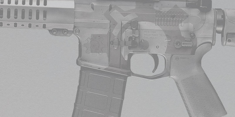
[#50]
Team members default avatar, what acog is on that rifle?
|
|
|
|

AR15.COM is the world's largest firearm community and is a gathering place for firearm enthusiasts of all types.
From hunters and military members, to competition shooters and general firearm enthusiasts, we welcome anyone who values and respects the way of the firearm.

Subscribe to our monthly Newsletter to receive firearm news, product discounts from your favorite Industry Partners, and more.
Copyright © 1996-2024 AR15.COM LLC. All Rights Reserved.
Any use of this content without express written consent is prohibited.
AR15.Com reserves the right to overwrite or replace any affiliate, commercial, or monetizable links, posted by users, with our own.