


[ARCHIVED THREAD] - Scariest Job Chart Ever... (Page 1 of 2)

Here's another interesting one:

There is an interactive version of the job loss map here (but it won't run on my computer because it's an old Pentium III 
|
|
Quoted:
Here's another interesting one: http://www.stat.columbia.edu/%7Ecook/movabletype/mlm/job-loss.png There is an interactive version of the job loss map here (but it won't run on my computer because it's an old Pentium III Growing like cancer |
|
Quoted:
Quoted:
That is unsettling, would be interesting to overlay 1929+ on top of that My first thought as well...I wonder why they left it out. Can't vouch for the accuracy of this, but a quick search indicates the current downturn is worse than all since the war, but still a ways to go before prewar stats: 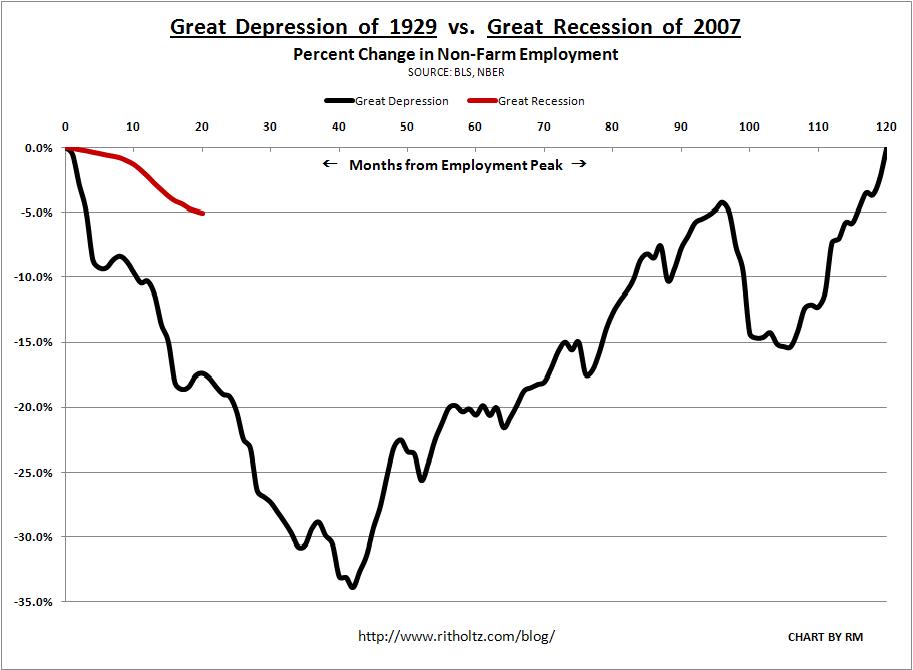
Current numbers may be artifically propped up for the short term by stimulus packages. |
|
Quoted:
Quoted:
Here's another interesting one: http://www.stat.columbia.edu/%7Ecook/movabletype/mlm/job-loss.png There is an interactive version of the job loss map here (but it won't run on my computer because it's an old Pentium III Growing like cancer It would be interesting to compare that against % of union labor. Somehow I think there just might be a bit of correlation... |
|
Interesting chart. We are dealing with a different economy than the post war 1948 one. We are at the tail end of an abrupt and thorough shift in the fundamental basis of our economy.
Just so that we are not all doom and gloom- http://www.slate.com/id/2222742/?obref=obinsite The Recession Is Over! What America's best economic forecaster is saying. By Daniel GrossPosted Tuesday, July 14, 2009, at 11:29 AM ET Illustration by Mark Alan Stamaty. Click image to expand.Could our long national nightmare be over? The economic contraction, this Great Recession, began in December 2007, and there's no apparent end in sight. As the unemployment rate has spiked, analysts have thrown cold water on Federal Reserve Chairman Ben Bernanke's March sighting of "green shoots." The stock market's spring rally has fizzled. Print This ArticlePRINTDiscuss in the FrayDISCUSSEmail to a FriendE-MAILGet Slate RSS FeedsRSSShare This ArticleRECOMMEND...Single PageSINGLE PAGE Yahoo! BuzzFacebook FacebookPost to MySpace!MySpaceMixx MixxDigg DiggReddit RedditDel.icio.us del.icio.usFurl FurlMa.gnolia.com Ma.gnoliaSphere SphereStumble UponStumbleUponCLOSE But in this season of doubt, I'm prepared to declare that the recession is really, most probably over. Why? Well, it's not because the economists surveyed by the Wall Street Journal believe it'll end in this quarter. (These guys wouldn't know an economic inflection point if it hit them upside the head. All through 2008, when the economy was contracting, they projected growth for the year.) No, two of the best and most objective forecasters, who are not connected to investment banks or to the CNBC noise machine, have recently called the upturn. Macroeconomic Advisers, the St. Louis-based consulting firm that compiles a monthly GDP index, reported to its clients Monday that while second-quarter GDP was tracking at negative 0.1 percent (recession), the third quarter was tracking at 2.4 percent growth. The folks at the Economic Cycles Research Institute agree enthusiastically. It's not because they've detected green pea shoots in Central Park. Rather, it's because we've seen the three P's, says Lakshman Achuthan, managing director at ECRI, which has been studying business cycles for decades and was one of the few outfits to call the last two recessions with any degree of accuracy. The economic data that get the most play in the news— unemployment, retail sales—are coincident or lagging indicators and historically have not revealed much about directional changes in the economy. ECRI's proprietary methodology breaks down indicators into a long-leading index, a weekly leading index, and a short-leading index. "We watch for turning points in the leading indexes to anticipate turning points in the business cycle and the overall economy," says Achuthan. It's tough to recognize transitions objectively "because so often our hopes and fears can get in the way." To prevent exuberance and despair from clouding vision, ECRI looks for the three P's: a pronounced rise in the leading indicators; one that persists for at least three months; and one that's pervasive, meaning a majority of indicators are moving in the same direction. The long-leading index—which goes back to the 1920s and doesn't include stock prices but does include measures related to credit, housing, productivity, and profits—hits bottom and starts to climb about six months before a recession ends. The weekly leading index calls directional shifts about three to four months in advance. And the short-leading index, which includes stock prices and jobless claims, is typically the last to turn up. All three are now flashing green. According to Achuthan, the long-leading index growth rate has been recovering since November 2008, the weekly leading index has been recovering since last December, and the short-leading index growth rate bottomed in February 2009. In sequence, each turned up, "and by April the three Ps had all been satisfied." Sure, corporate profits continue to disappoint, and the unemployment rate is climbing. But for ECRI, which navigates by relying exclusively on its instruments, that's only a part of their picture. They're the Spocks of the economic forecasting crowd—unemotional, uninvested in anything but the logic of what history and their dashboard tell them. "From our vantage point, every week and every month our call is getting stronger, not weaker, including over the last few weeks," says Achuthan. "The recession is ending somewhere this summer." In fact, it may already be over. There's plenty of ground for skepticism, in part because the news flow is still quite negative, especially when it comes to corporate profits. ECRI's response? "Indicators are typically judged by their freshness, not their prescience. Since most market-moving numbers are coincident to short leaning, while corporate guidance is often lagging, it is no surprise that analysts do not discern any convincing evidence of an economic upturn." Still, Achuthan warns that one of the most important indicators—employment—isn't showing recovery yet. The reason: The combination of deleveraging and the long-term decline of manufacturing is hindering job creation and destroying existing jobs. After the last recession ended in 2001, the service sector created jobs, but payroll employment continued to fall through 2003 because millions of jobs were lost in the manufacturing sector during the expansion. "We may see some echo of that in this recovery." But while employment is vital, payroll jobs growth alone doesn't make the difference between recession and expansion. "We've always felt that employment is very important, but it's a roughly coincident indicator," said Achuthan. "We would not expect the employment indicators to be mirroring anything we're seeing in the leading indicators." ECRI notes that job losses and unemployment claims are off their worst levels. "If we're right and the recession is over, the job market should improve by year's end." Of course, improvement doesn't mean the sort of 1990s-vintage broad-based employment growth that boosts wages and expands benefits coverage. And without the tailwind of cheap money and a housing boom, it's difficult to see—as it always is at the beginning of expansions—what is going to produce large-scale jobs growth. The recession is over! Let the jobless recovery begin! |
|
Quoted: Here's another interesting one: http://www.stat.columbia.edu/%7Ecook/movabletype/mlm/job-loss.png There is an interactive version of the job loss map here (but it won't run on my computer because it's an old Pentium III Doesn't look too bad in the central states yet. |
|
Quoted:
http://dont-tread-on.me/wow-the-scariest-job-chart-ever http://dont-tread-on.me/wp-content/uploads/2009/10/f.jpg Hmmm, I thought that, even by the .gov's cooked #'s, we were at 9.8% unemployment? I think the real number is closer to 20%... 1/5 out of work. Headlines: 263,000 "jobs lost" and unemployment rate up to 9.8%.


That's not good - there goes the "second derivative" argument. Weekly earnings are also down by $1.54, which is bad news too. But the Household Data is VASTLY worse than reported. Here are the month-over-month changes, and they're in the realm of frightening. (all numbers in thousands) Civilian Labor Force: 154,879 to 153,617 this month. Employed: 140,074 down to 139,079 this month. That's a loss of 995,000 jobs, not 263,000, and the labor force contracted by 1,262,000 people! The participation rate was absolutely decimated, down 0.6% this last month alone. The people "not in the labor force" rose by a staggering 1,516,000 in the last month. The government doesn't count people as "unemployed" who have given up and exited the labor force, but as I have repeatedly noted whether the government counts them or not the corner store owner sure as hell does! The fact of the matter is that nearly 1 million fewer people were working in September as compared to August; there has been absolutely no improvement in that trend whatsoever. 
|
|
Quoted:
Looks like people are moving to texas and starting jobs there. I'm in western TN, things are looking slowly worse here. That chart goes from Feb 2008 - Feb 2009. In 2008 ~70% of all new jobs in the nation were created in TX. That's why that chart doesn't have a huge red splotch here. But don't expect 2009 to look like that. |
|
Quoted: Here's another interesting one: http://www.stat.columbia.edu/%7Ecook/movabletype/mlm/job-loss.png There is an interactive version of the job loss map here (but it won't run on my computer because it's an old Pentium III 2008 Presidential Election map by county...........  |
|
Quoted:
Quoted:
Here's another interesting one: http://www.stat.columbia.edu/%7Ecook/movabletype/mlm/job-loss.png There is an interactive version of the job loss map here (but it won't run on my computer because it's an old Pentium III Doesn't look too bad in the central states yet. It's plotting absolute numbers of job losses, so the sparsely populated states will never show as much. Texas is getting by, but the upper midwest (Michigan in particular) goes from slight bleeding to uncontrolled hemorrhaging. I finally got the sequence to run on my old computer. You can see the shifting around mid 2008 (when the Obama phenomenon started to take off) and it just explodes into red in November '08 when he wins. Note also that even in the midst of a sea of red in the Northeast Corridor, DC manages to keep itself in the blue for most of the entire meltdown. 
|
|
Quoted:
Note also that even in the midst of a sea of red in the Northeast Corridor, DC manages to keep itself in the blue for most of the entire meltdown. Government spending is masking the magnitude of this recession. It would be interesting to note how many jobs are government paid or government subsidized. It's no coincidence that all of our economic "Baghdad Bobs" derive a significant part of their income from Government spending. |
|
Quoted:
Quoted:
Quoted:
Here's another interesting one: http://www.stat.columbia.edu/%7Ecook/movabletype/mlm/job-loss.png There is an interactive version of the job loss map here (but it won't run on my computer because it's an old Pentium III Doesn't look too bad in the central states yet. It's plotting absolute numbers of job losses, so the sparsely populated states will never show as much. Texas is getting by, but the upper midwest (Michigan in particular) goes from slight bleeding to uncontrolled hemorrhaging. I finally got the sequence to run on my old computer. You can see the shifting around mid 2008 (when the Obama phenomenon started to take off) and it just explodes into red in November '08 when he wins. Note also that even in the midst of a sea of red in the Northeast Corridor, DC manages to keep itself in the blue for most of the entire meltdown. Yup, the jobs gained start to drop off in May '08, falls to 89k lost in August, suddenly falls massively to 730k lost in September, nothing happens in October, and then it goes off a cliff to 2.1 million lost in November (Obama's election ?). It's at 2.5 million for December, then falls to 4 million in January (Obama's inauguration ?), falls to 5 million by March, and is at 5.5 million in June where the data ends. |
|
Quoted:
Quoted:
Here's another interesting one: http://www.stat.columbia.edu/%7Ecook/movabletype/mlm/job-loss.png There is an interactive version of the job loss map here (but it won't run on my computer because it's an old Pentium III http://www.stat.columbia.edu/%7Ecook/movabletype/mlm/job-loss.png 2008 Presidential Election map by county........... http://i651.photobucket.com/albums/uu240/Skg_Mre_Lght/2008-election-map-wash-post.gif Extremely interesting correlation. Looks like there might be a few people in blue counties that have buyers remorse? |
|
Answer me this:
If job losses start mounting in june 2007, then why does that map state 5,556,000,000 jobs lost nationwide nationwide since June 2008?, not June 2007? And to make matters even worse, Current job loss tallies sine the start of the recession in Dec 2007 are reported to be 10 million, more than double than what the interactive map shows. What is truly frightening is that that interactive map under reports the seriousness of our job losses by nearly 1/2. ******************************************************************************************************************************************* What would be truly interesting would be corresponding time lapse maps of China and the USA. Maybe Outsourcing/Globalization map to show what we gave in return for China funding our national debt.
|
|
Quoted:
Answer me this: If job losses start mounting in june 2007, then why does that map state 5,556,000,000 jobs lost nationwide nationwide since June 2008?, not June 2007? And to make matters even worse, Current job loss tallies sine the start of the recession in Dec 2007 are reported to be 10 million, more than double than what the interactive map shows. What is truly frightening is that that interactive map under reports the seriousness of our job losses by nearly 1/2. ******************************************************************************************************************************************* What would be truly interesting would be corresponding time lapse maps of China and the USA. Maybe Outsourcing/Globalization map to show what we gave in return for China funding our national debt. I think they are using a sliding "jobs lost in the previous 12 months" tally to compare apples to apples. The cumulative total is of course much higher. Data can be massaged depending on what point you use for a starting reference. Any way you slice it, it ain't good. When I look at the capital equipment companies are selling off, I can only conclude that many jobs will never be returning. Also note that our own subnet was near the epicentre of the MI-OH-IN meltdown. |
|
Quoted:
Quoted:
Quoted:
That is unsettling, would be interesting to overlay 1929+ on top of that My first thought as well...I wonder why they left it out. Can't vouch for the accuracy of this, but a quick search indicates the current downturn is worse than all since the war, but still a ways to go before prewar stats: http://www.ritholtz.com/blog/wp-content/uploads/2009/09/1929-VS-2007.JPG Current numbers may be artifically propped up for the short term by stimulus packages. Another problem with this chart is that it is U3 instead of U6 numbers. And none of these charts or BLS numbers have any independent contractors (1099ers) factored in. How many independent one-man small businesses are belly up? In trucking, its described by one word: THOUSANDS. |
|
Quoted:
Quoted:
Yet officially; current unemployment levels never reach 10%. They will,just wait until after Christmas,when lots of big named/big box stores see nothing but red on their books. I don't believe they ever will since the government is obviously fudging the numbers and besides; individuals whose unemployment benefits have run out are no longer counted as being out of work. Think of it as a sausage machine that automatically cuts the sausages to a length of 9.8 inches; no matter how many tons of meat go through the grinder, the average length of the sausage will never reach 10 inches. |
|
Quoted:
Quoted:
Quoted:
Quoted:
That is unsettling, would be interesting to overlay 1929+ on top of that My first thought as well...I wonder why they left it out. Can't vouch for the accuracy of this, but a quick search indicates the current downturn is worse than all since the war, but still a ways to go before prewar stats: http://www.ritholtz.com/blog/wp-content/uploads/2009/09/1929-VS-2007.JPG Current numbers may be artifically propped up for the short term by stimulus packages. Another problem with this chart is that it is U3 instead of U6 numbers. And none of these charts or BLS numbers have any independent contractors (1099ers) factored in. How many independent one-man small businesses are belly up? In trucking, its described by one word: THOUSANDS. i'd be interested to learn how the unemployment rate calculation has changed since the 30's. The recent numbers show the labor force as shrinking rapidly, and since someone who isn't officially in the "labor force" can't be counted as unemployed, it seems to indicate that the true unemployment rate is well above 10% |
|
Quoted: I'd be interested to learn how the unemployment rate calculation has changed since the 30's. The recent numbers show the labor force as shrinking rapidly, and since someone who isn't officially in the "labor force" can't be counted as unemployed, it seems to indicate that the true unemployment rate is well above 10% What does that mean? Who "isn't in the labor force"? Are you talking about kids and people who have retired? |
|
Quoted:
Quoted:
Quoted:
That is unsettling, would be interesting to overlay 1929+ on top of that My first thought as well...I wonder why they left it out. yeah I scanned thru looking for the 1930's graph line preciate the change! We're not done yet. What masks our unemployment data the most is those that disappear from the data because they are "no longer looking" for various reasons. http://market-ticker.denninger.net/authors/2-Karl-Denninger Employment: You're SMOKING Green "Shoots"Grrrr.... after hearing packs of lies all day on "Tout TV" regarding the radically worse-than-expected employment report, and on the back of my own report on the data, I am compelled to post some CHARTS.
Let's start with this one:
Note that all of these are from the BLS "A" tables - that is the actual count of people from a survey, not the cooked, "birth-death-adjusted" nonsense that BLS calls a "headline" number.
This first chart shows the bad news - the blue line is monthly change from the previous month. It is very noisy, as you'd expect.
The solid line is annualized change - that is, the actual count compared to one year prior.
Notice that employment went to a negative 12-month rate of change right at the start of 2008 - coincidentally, right at the start of the official "start" of the recession.
Also note that the last recession, which began at the end of the first quarter of 2001, also had the rate of change on a 12-month basis go negative at roughly the same time.
(Not-so-coincidentally, you also got a 12 month advance warning of the recession when the trend changed in both cases too. Now you know what one of the indicators I used in my 2008 "Outlook" Ticker in which I said we would enter a formal recession was.....)
I want to to pay particular attention to the bottom of the last recession, which was (officially) 11/01.
Notice that the spike bottom in the first derivative, that is, when the rate of change on a 12 month basis turned positive, was almost exactly when NBER called that recession (in retrospect) "over".
Has the first derivative turned in the table at this point on an annualized basis? NO.
First question: What does this say about the calls that "the recession is over"?
You will also note that in terms of the 12 month rate of change this recession is more than three times as severe in its impact on employment as was the 2001 recession. In fact, "by the numbers" we have 8,236,000 fewer people employed now than we had at the peak in July of 2007.
It is, however, worse than it first appears. Here's the second chart, and this is the chart that, if you're sentient, should be sending cold chills up and down your spine:
Again, the monthly change data is in light blue, the annualized in red.
This chart shows that since 1999 (the furthest back I have ready access to the BLS data in easy-to-chart form) the number of persons that are not in the labor force has continually risen on a 12 month trend basis. While it has reached "zero" on two occasions and gotten close once more the number of people in the country but not in the labor force continues to rise.
If we were a "gentifying" population this would be bad. But the boomers are not yet starting to retire in significant numbers; at present we are adding about 150,000 "working age" people to the population each and every month, or about 1.8 million annually.
YET WE ARE LOSING PEOPLE IN THE LABOR FORCE AS THEY EITHER GIVE UP OR DECIDE TO LIVE ON THE DOLE!
This is an unmitigated catastrophe, and it did NOT abate during the so-called "economic expansion" of the 2000s. If that was a true economic expansion - that is, driven by people going to work and earning a productive living - then the "NILF" numbers would have contracted on a 12 month trailing basis during that so-called "expansion."
They did not, which means the so-called "expansion" didn't come through productive labor.
To put this in context unless this number is at -1800 (or less) we are not "absorbing" the new workers that come into the market - that is, while we "lost" 8.2 million jobs in this recession thus far we have also managed to stuff at least twice that many more people of working age who aren't working into this country in that same amount of time, and none of them show up in the official "unemployment" statistics because none of the people in the "Not In Labor Force" bucket are "looking for work."
If that "expansion" did not come through productive labor, where did it come from?
Do I REALLY need to put this graph up again?
What comes next?

|


|
Quoted:
Quoted:
Quoted:
That is unsettling, would be interesting to overlay 1929+ on top of that My first thought as well...I wonder why they left it out. Can't vouch for the accuracy of this, but a quick search indicates the current downturn is worse than all since the war, but still a ways to go before prewar stats: http://www.ritholtz.com/blog/wp-content/uploads/2009/09/1929-VS-2007.JPG Current numbers may be artifically propped up for the short term by stimulus packages. plus government cooking the books. "what you've been out of work over 6months and gave up looking for work? guess what, you're not unemployed!" "aww got shit canned and went back to school? guess what, you're not unemployeD!" sorry for all the unemployed folks out there; i hope things get better. |
|
Hell I thought I just couldnt find another job in Atlanta because I don't speak spanish (My girlfriend isnt qualified to sell running shoes at Finish Line because she doesnt speak spanish Its really going to shit in that place. I've been trying for months to find a second PT or altogether new job. I think I shall sub-lease my apartment and get the FUCK out. |
|
Quoted:
Quoted:
Quoted:
Quoted:
That is unsettling, would be interesting to overlay 1929+ on top of that My first thought as well...I wonder why they left it out. Can't vouch for the accuracy of this, but a quick search indicates the current downturn is worse than all since the war, but still a ways to go before prewar stats: http://www.ritholtz.com/blog/wp-content/uploads/2009/09/1929-VS-2007.JPG Current numbers may be artifically propped up for the short term by stimulus packages. plus government cooking the books. "what you've been out of work over 6months and gave up looking for work? guess what, you're not unemployed!" "aww got shit canned and went back to school? guess what, you're not unemployeD!" sorry for all the unemployed folks out there; i hope things get better. Just so everyone knows, most of the employment data that isn't figured by paper data(Unemployment checks and what not) is figured by a survey of 50,000 people. Roughly .02% (and FALLING) of the unattached unemployed. |
|
Quoted: Quoted: What does that mean? Who "isn't in the labor force"? Are you talking about kids and people who have retired?I'd be interested to learn how the unemployment rate calculation has changed since the 30's. The recent numbers show the labor force as shrinking rapidly, and since someone who isn't officially in the "labor force" can't be counted as unemployed, it seems to indicate that the true unemployment rate is well above 10% |

|
Quoted:
I think the tribes are rural/farming jobs verses urban/industrial jobs not progressives verses conservatives. At least get the teams right. China ain't growing enough food to destroy the American farmer yet.  Problem is the American farmer needs credit to keep his operation going,with farm commodites dropping,that's gonna be harder to get. I took a Toyota parts run through the farm country of IL,and I could see everyone's former financial success out on their front lawns. Motorcycles/pick-ups/ATVs/boats/jetskis/farm equipment all out there with a FOR SALE sign. Tractor dealers with lots FULL of new equipment. And the towns looking not much different than if some plague hit. I keep wondering who's buying all these new cars. What fool would put themselves in debt in a time like this. Or are we gonna just fill up storage lots full of new cars again? |
|
Quoted:
Quoted:
Quoted:
What does that mean? Who "isn't in the labor force"? Are you talking about kids and people who have retired?
I'd be interested to learn how the unemployment rate calculation has changed since the 30's. The recent numbers show the labor force as shrinking rapidly, and since someone who isn't officially in the "labor force" can't be counted as unemployed, it seems to indicate that the true unemployment rate is well above 10% He's talking about “marginally attached to the labor force” which also includes discouraged workers. They are not included in the unemployment numbers. This number is growing rapidly. It was around 2 million in April and almost 3 million now. From April just to get an idea. There is a lot good(well not SO good) info at the BLS website that the media isn't talking about. http://www.bls.gov/opub/ils/pdf/opbils74.pdf |
|
Quoted:
Quoted:
Quoted:
Quoted:
That is unsettling, would be interesting to overlay 1929+ on top of that My first thought as well...I wonder why they left it out. yeah I scanned thru looking for the 1930's graph line preciate the change! We're not done yet. What masks our unemployment data the most is those that disappear from the data because they are "no longer looking" for various reasons. http://market-ticker.denninger.net/authors/2-Karl-Denninger Employment: You're SMOKING Green "Shoots" |
|
Quoted: Quoted: He's talking about “marginally attached to the labor force” which also includes discouraged workers. They are not included in the unemployment numbers. This number is growing rapidly. It was around 2 million in April and almost 3 million now.Quoted: Quoted: What does that mean? Who "isn't in the labor force"? Are you talking about kids and people who have retired?I'd be interested to learn how the unemployment rate calculation has changed since the 30's. The recent numbers show the labor force as shrinking rapidly, and since someone who isn't officially in the "labor force" can't be counted as unemployed, it seems to indicate that the true unemployment rate is well above 10% From April just to get an idea. There is a lot good(well not SO good) info at the BLS website that the media isn't talking about. http://www.bls.gov/opub/ils/pdf/opbils74.pdf I would definitely consider those people "unemployed". I don't know what the folk who were making those statistics were thinking. |

