|
Posted: 10/9/2017 2:01:44 PM EDT
I have a senior this year who has provided 4 years of excellent work and service. I am also very close friends of the family. Any ideas for something different and spectacular for senior photos? I wouldn't mind buying some gear for this if I need to. I currently have a couple of flashes and a tripod. I know that's far off from where I might need to be for some of the ideas which will come out of this I hope.
We've already done one like this and I think it turned out just as well. She wanted one like that, but it's one of those things I don't understand. Why is that person blowing confetti all over their year? Why is that girl standing on a chair in a pond? Does that person lying on the railroad tracks have a death wish? 
|
|
|
|
[#1]
I just googled "senior photo ideas". They're all horrible. I mean, really awful. I'm so sorry. There's nothing I can do for you. Is it too late for her to drop out and get her GED instead?
eta: These aren't so bad. 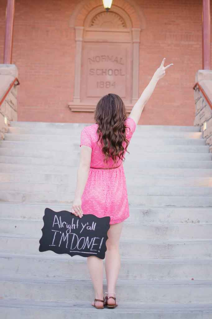

|
|
|
|
[#2]
I would agree for the most part. I just don't understand most of them.
Thanks for the suggestions though. I do really like the one with the yearbooks. This girl has worked for me in YB for years now so she wants to incorporate them into the pics. |
|
|
|
[#3]
I see you addressed this, but it bears repeating, for others to see...
Please overcome the urge to use active railroad tracks as a backdrop. ByteTheBullet (-: |
|
|
|
[#4]
Quoted:
I see you addressed this, but it bears repeating, for others to see... Please overcome the urge to use active railroad tracks as a backdrop. ByteTheBullet (-: and a weathered barn wall |
|
|
|
[#5]
Quoted:
and an "urban" doorway and a weathered barn wall |
|
|
|
[#6]
Get her a sombrero and a fake mustache. Across the pic, photoshop "My Señor Photo".
|
|
|
|
[#7]
Quoted:
What's an urban doorway? Quoted:
Quoted:
and an "urban" doorway and a weathered barn wall |
|
|
|
[#8]
Quoted:
Get her a sombrero and a fake mustache. Across the pic, photoshop "My Señor Photo". |
|
|
|
[#9]
I too like the idea of the fake mustache and sombrero. |
|
|
|
[#10]
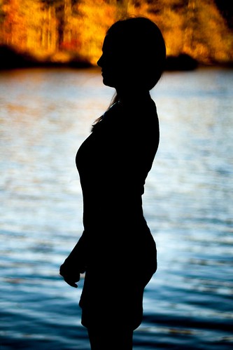
I went out to a state park with her on Saturday and it went about as well as one could expect given the conditions and the fact that we had no real plan or location scouted. I'll get some pics up soon.
ETA: Here are a couple that don't show her face. I really enjoyed the ones we did which were different than the usual stuff you see. I liked the silhouette. 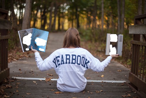 IMG_5618edited IMG_5618edited
 IMG_5660edited IMG_5660edited
|
|
|
|
[#11]
Quoted:
I went out to a state park with her on Saturday and it went about as well as one could expect given the conditions and the fact that we had no real plan or location scouted. I'll get some pics up soon. ETA: Here are a couple that don't show her face. I really enjoyed the ones we did which were different than the usual stuff you see. I liked the silhouette. https://farm5.staticflickr.com/4475/37181857494_dfe03cbf23.jpgIMG_5618edited https://farm5.staticflickr.com/4467/37860517722_63deef5a3e.jpgIMG_5660edited They are exposed and processed nicely. Two things that just kill it for me are the horizons. Top photo should be straightened up and centered. You're using the bridge as a frame. No one likes a crooked frame. Bottom photo should have the horizon line below the head or above it, not going through it. the big black...thing... coming out of the back of her head is distracting. Overall, thanks for not doing what everyone else does. I hate the idea of senior photos mainly because of all the crap thats out there. I've doen a few, but usually just refer out. |
|
|
|
[#12]
How about a side shot of her walking down the sidewalk with her head in a book for the college admissions of her choice carrying a rolling suitcase behind her?
|
|
|
|
[#13]
Quoted:
If you don't mind a bit of critique here.... They are exposed and processed nicely. Two things that just kill it for me are the horizons. Top photo should be straightened up and centered. You're using the bridge as a frame. No one likes a crooked frame. Bottom photo should have the horizon line below the head or above it, not going through it. the big black...thing... coming out of the back of her head is distracting. Overall, thanks for not doing what everyone else does. I hate the idea of senior photos mainly because of all the crap thats out there. I've doen a few, but usually just refer out. In the first photo are you talking about rotating the photo so everything is level? I haven't done much work to that one (or any of them for that matter). I totally agree with what you're saying if what I got out of your comment was what you were trying to convey. In regard to the horison in that photo, where would you have put it? I took that shot from a few angles, but liked the "out of the camera" look of that one the best. In the second photo I see exactly what you're saying. I did a pretty poor job there, but I assure you it's better than when she was a few feet to the right of the frame and a fallen tree in the water made it look like she had quite the appendage coming off of her pelvis. Yikes. Thanks again for the feedback. |
|
|
|
[#14]
Quoted:
How about a side shot of her walking down the sidewalk with her head in a book for the college admissions of her choice carrying a rolling suitcase behind her? |
|
|
|
[#15]
What about getting her friends together for 'senior' photos?

|
|
|
|
[#16]
Quoted:
What about getting her friends together for 'senior' photos? https://i.pinimg.com/736x/f5/04/46/f5044675f3afa566f98b35a376b0c7b8--old-lady-costume-ladies-costumes.jpg  
|
|
|
|
[#17]
Quoted:
I appreciate the notes greatly. In the first photo are you talking about rotating the photo so everything is level? I haven't done much work to that one (or any of them for that matter). I totally agree with what you're saying if what I got out of your comment was what you were trying to convey. In regard to the horison in that photo, where would you have put it? I took that shot from a few angles, but liked the "out of the camera" look of that one the best. In the second photo I see exactly what you're saying. I did a pretty poor job there, but I assure you it's better than when she was a few feet to the right of the frame and a fallen tree in the water made it look like she had quite the appendage coming off of her pelvis. Yikes. Thanks again for the feedback. Quoted:
Quoted:
If you don't mind a bit of critique here.... They are exposed and processed nicely. Two things that just kill it for me are the horizons. Top photo should be straightened up and centered. You're using the bridge as a frame. No one likes a crooked frame. Bottom photo should have the horizon line below the head or above it, not going through it. the big black...thing... coming out of the back of her head is distracting. Overall, thanks for not doing what everyone else does. I hate the idea of senior photos mainly because of all the crap thats out there. I've doen a few, but usually just refer out. In the first photo are you talking about rotating the photo so everything is level? I haven't done much work to that one (or any of them for that matter). I totally agree with what you're saying if what I got out of your comment was what you were trying to convey. In regard to the horison in that photo, where would you have put it? I took that shot from a few angles, but liked the "out of the camera" look of that one the best. In the second photo I see exactly what you're saying. I did a pretty poor job there, but I assure you it's better than when she was a few feet to the right of the frame and a fallen tree in the water made it look like she had quite the appendage coming off of her pelvis. Yikes. Thanks again for the feedback. YOu don't need to rotate so that everything is level... just rotate so that the primary visual indicator is level. For example, if the white strip wasn't there, you would rotate so that the right side handrail post was vertical. Personally I'd crop the handrail out because you have lens distortion that will prevent you from getting the white line AND the post squared up. Second photo's horizon doesn't bother me as much |
|
|
|
[#18]
My Daughters senior pictures had our dog in some and her in her Kayak In the river in others.
|
|
|
|
[#19]
Quoted:
Rotated based upon the white strip: https://www.AR15.Com/media/mediaFiles/26797/37181857494_dfe03cbf23-2-343602.JPG YOu don't need to rotate so that everything is level... just rotate so that the primary visual indicator is level. For example, if the white strip wasn't there, you would rotate so that the right side handrail post was vertical. Personally I'd crop the handrail out because you have lens distortion that will prevent you from getting the white line AND the post squared up. https://www.AR15.Com/media/mediaFiles/26797/37181857494_dfe03cbf23-3-343611.JPG Second photo's horizon doesn't bother me as much I also like the senior citizen photo idea. That one is fun. |
|
|
 Win a FREE Membership!
Sign up for the ARFCOM weekly newsletter and be entered to win a free ARFCOM membership. One new winner* is announced every week!
You will receive an email every Friday morning featuring the latest chatter from the hottest topics, breaking news surrounding legislation, as well as exclusive deals only available to ARFCOM email subscribers.

AR15.COM is the world's largest firearm community and is a gathering place for firearm enthusiasts of all types.
From hunters and military members, to competition shooters and general firearm enthusiasts, we welcome anyone who values and respects the way of the firearm.

Subscribe to our monthly Newsletter to receive firearm news, product discounts from your favorite Industry Partners, and more.
Copyright © 1996-2024 AR15.COM LLC. All Rights Reserved.
Any use of this content without express written consent is prohibited.
AR15.Com reserves the right to overwrite or replace any affiliate, commercial, or monetizable links, posted by users, with our own.