|
[#1]
He'll be missed...
|
|
|
|
[#2]
Hope and Change. Only was was had.
|
|
|
|
[#3]

|
|
|
|
[#4]
Silicon Valley made out like a bandit.

|
|
|
|
[#5]
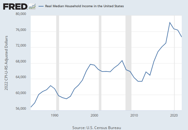
the charts are powerful, but beware--they violate one of the most fundamental principles of statistics data viz. as a general principle, any time the series on the y axis does not start at 0, the chart is deceptive because it magnifies the visual weight of the difference. people parse charts by comparing visual ratios, not by carefully examining the axis details. for example, chart 1 (student loans) is very straightforward and robust. chart 7 (workers' share oft he economy) is very deceptive, since the graphic appears to represent a change from almost 100% to almost 0%. however, inspecting the y-axis shows it to be a change of only ~6%.
some of those charts are straight out of the "how to lie with statistics" playbook. they're not wrong--they're just distorted in order to make the change look bigger than it actually is. if you put them in front of someone who deals with quantitative data, you're probably going to get called out on it. |
|
|
|
[#6]
He did everything he could.
*To destroy racist, imperial/colonial America. |
|
|
|
[#7]
FBHO
|
|
|
|
[#8]
Quoted:
He'll be missed... Not by anyone here. |
|
|
|
[#9]
Holy s#%(
|
|
|
|
[#10]
Wow
|
|
|
|
[#11]
Debt is up. That's good, right?
|
|
|
|
[#12]
too bad the charts stop in 2013
|
|
|
|
[#13]
Quoted:
He'll be missed... He'll be missed . . . . like an infectious rash that takes eight years to go away. |
|
|
|
[#14]
Most of those charts are about four years old, so Obama would blame Bush. The last few years look better.
|
|
|
|
[#15]
Those fucking Russians have their hand in everything........
|
|
|
|
[#16]
Bush's fault.
|
|
|
|
[#17]
Thanks Obama!
Thanks idiot liberals! 
|
|
|
|
[#18]
Quoted:
Thanks Obama! Thanks idiot liberals! |
|
|
|
[#19]
Quoted:
He'll be missed . . . . like an |
|
|
|
[#20]
Quoted:
the charts are powerful, but beware--they violate one of the most fundamental principles of statistics data viz. as a general principle, any time the series on the y axis does not start at 0, the chart is deceptive because it magnifies the visual weight of the difference. people parse charts by comparing visual ratios, not by carefully examining the axis details. for example, chart 1 (student loans) is very straightforward and robust. chart 7 (workers' share oft he economy) is very deceptive, since the graphic appears to represent a change from almost 100% to almost 0%. however, inspecting the y-axis shows it to be a change of only ~6%. some of those charts are straight out of the "how to lie with statistics" playbook. they're not wrong--they're just distorted in order to make the change look bigger than it actually is. if you put them in front of someone who deals with quantitative data, you're probably going to get called out on it. While I agree with your underlying statement, take a look at the links below. Most go back decades, and include 2016. Paints a pretty grim picture... 1:) Student Loans 2:) Food Stamps 3:) Federal Debt 4:) Money Printing 5:) Couldn't find the data...will update when I do. That said: Obamacare premiums to soar 22% in 2017 6:) Labor Force Participation 7:) Worker's Share of the Economy 8:) Median Family Income 9:) Home Ownership |
|
|
|
[#21]
Quoted:
the charts are powerful, but beware--they violate one of the most fundamental principles of statistics data viz. as a general principle, any time the series on the y axis does not start at 0, the chart is deceptive because it magnifies the visual weight of the difference. people parse charts by comparing visual ratios, not by carefully examining the axis details. for example, chart 1 (student loans) is very straightforward and robust. chart 7 (workers' share oft he economy) is very deceptive, since the graphic appears to represent a change from almost 100% to almost 0%. however, inspecting the y-axis shows it to be a change of only ~6%. some of those charts are straight out of the "how to lie with statistics" playbook. they're not wrong--they're just distorted in order to make the change look bigger than it actually is. if you put them in front of someone who deals with quantitative data, you're probably going to get called out on it. Thank you for pointing that out. I had missed it and it'll be useful in other areas. |
|
|
|
[#22]
Thomas Payne didn't have anything good to say about Obama
|
|
|
|
[#23]
Quoted:
the charts are powerful, but beware--they violate one of the most fundamental principles of statistics data viz. as a general principle, any time the series on the y axis does not start at 0, the chart is deceptive because it magnifies the visual weight of the difference. people parse charts by comparing visual ratios, not by carefully examining the axis details. for example, chart 1 (student loans) is very straightforward and robust. chart 7 (workers' share oft he economy) is very deceptive, since the graphic appears to represent a change from almost 100% to almost 0%. however, inspecting the y-axis shows it to be a change of only ~6%. some of those charts are straight out of the "how to lie with statistics" playbook. they're not wrong--they're just distorted in order to make the change look bigger than it actually is. if you put them in front of someone who deals with quantitative data, you're probably going to get called out on it. Exactly. I can't show this to any of my science colleagues, because they are not all indicating the same timeframe. Y-axis issues I can live with, as long as we're looking at equal/preceding timescales to interpret a trend. They need to fix their charting so that the real debate can happen around the validity of the information. |
|
|
|
[#24]
Quoted:
the charts are powerful, but beware--they violate one of the most fundamental principles of statistics data viz. as a general principle, any time the series on the y axis does not start at 0, the chart is deceptive because it magnifies the visual weight of the difference. people parse charts by comparing visual ratios, not by carefully examining the axis details. for example, chart 1 (student loans) is very straightforward and robust. chart 7 (workers' share oft he economy) is very deceptive, since the graphic appears to represent a change from almost 100% to almost 0%. however, inspecting the y-axis shows it to be a change of only ~6%. some of those charts are straight out of the "how to lie with statistics" playbook. they're not wrong--they're just distorted in order to make the change look bigger than it actually is. if you put them in front of someone who deals with quantitative data, you're probably going to get called out on it. Blah blah blah. Statistics You can normalize everything at zero or parse significant pieces Sure if you start at zero the graph will look less significant. Simple conclusions to draw. Everything trends downward I don't have the data and I am sure all downward trends are statistically significant If you had the data and could multiply the percentages by the actual number you would see loss in millions Or Excuse me, trillions I forgot some trends do go up. The ones that sucks us dry. Food stamps, debt, etc Sigma! |
|
|
|
[#25]
Quoted:
While I agree with your underlying statement, take a look at the links below. Most go back decades, and include 2016. Paints a pretty grim picture... oh, i completely agree that the data the charts represent is an accurate state of affairs--i'm not disputing that at all. it's the presentation that i'm concerned with. to someone with a quantitative background, it looks like a deliberate distortion. |
|
|
|
[#26]
Quoted:
Sure if you start at zero the graph will look less significant. exactly--if the axis starts at zero, it will accurately reflect the difference. distorting the truth in order to score political points is liberal behavior. |
|
|
|
[#27]
Quoted:
Exactly. I can't show this to any of my science colleagues, because they are not all indicating the same timeframe. Y-axis issues I can live with, as long as we're looking at equal/preceding timescales to interpret a trend. They need to fix their charting so that the real debate can happen around the validity of the information. Quoted:
Quoted:
the charts are powerful, but beware--they violate one of the most fundamental principles of statistics data viz. as a general principle, any time the series on the y axis does not start at 0, the chart is deceptive because it magnifies the visual weight of the difference. people parse charts by comparing visual ratios, not by carefully examining the axis details. for example, chart 1 (student loans) is very straightforward and robust. chart 7 (workers' share oft he economy) is very deceptive, since the graphic appears to represent a change from almost 100% to almost 0%. however, inspecting the y-axis shows it to be a change of only ~6%. some of those charts are straight out of the "how to lie with statistics" playbook. they're not wrong--they're just distorted in order to make the change look bigger than it actually is. if you put them in front of someone who deals with quantitative data, you're probably going to get called out on it. Exactly. I can't show this to any of my science colleagues, because they are not all indicating the same timeframe. Y-axis issues I can live with, as long as we're looking at equal/preceding timescales to interpret a trend. They need to fix their charting so that the real debate can happen around the validity of the information. This. The X axes are all over the place and printed so small that it's a bit of effort to figure out what they represent. If you stack several charts the implication is that they follow the same rules and thus can be compared visually. |
|
|
|
[#28]
some of those were going to shit before he took over. It's not that he was or wasn't responsible for them, it's the fact he did jack or shit about actually fixing it 
|
|
|
|
[#29]
Quoted:
the charts are powerful, but beware--they violate one of the most fundamental principles of statistics data viz. as a general principle, any time the series on the y axis does not start at 0, the chart is deceptive because it magnifies the visual weight of the difference. people parse charts by comparing visual ratios, not by carefully examining the axis details. for example, chart 1 (student loans) is very straightforward and robust. chart 7 (workers' share oft he economy) is very deceptive, since the graphic appears to represent a change from almost 100% to almost 0%. however, inspecting the y-axis shows it to be a change of only ~6%. some of those charts are straight out of the "how to lie with statistics" playbook. they're not wrong--they're just distorted in order to make the change look bigger than it actually is. if you put them in front of someone who deals with quantitative data, you're probably going to get called out on it. Here's the full adjusted monetary base chart. Looks good 
|
|
|
|
[#30]
Quoted:
Here's the full adjusted monetary base chart. Looks good http://getgold999.com/wp-content/uploads/2015/01/2015-01-21_0846-StLouis-adjusted-monetary-base.png as i wrote, some of the charts are fine. but putting a 0-based y axis graph next to an otherwise identically-formatted non-0-based y axis graph makes the viz even more deceptive. makes it look like a deliberate misrepresentation rather than an honest mistake. so if anyone gets called out on these figures, they will appear to be either deceptive or incompetent. that's a bad place to be in an argument. normalize that shit like a good statistician, and all these problems go away. |
|
|
|
[#31]
Quoted:
the charts are powerful, but beware--they violate one of the most fundamental principles of statistics data viz. as a general principle, any time the series on the y axis does not start at 0, the chart is deceptive because it magnifies the visual weight of the difference. people parse charts by comparing visual ratios, not by carefully examining the axis details. for example, chart 1 (student loans) is very straightforward and robust. chart 7 (workers' share oft he economy) is very deceptive, since the graphic appears to represent a change from almost 100% to almost 0%. however, inspecting the y-axis shows it to be a change of only ~6%. some of those charts are straight out of the "how to lie with statistics" playbook. they're not wrong--they're just distorted in order to make the change look bigger than it actually is. if you put them in front of someone who deals with quantitative data, you're probably going to get called out on it. Yep +1 |
|
|
|
[#32]
bu the told us he reduced the annual deficit faster then any other president.

|
|
|
|
[#33]
Quoted:
Here's the full adjusted monetary base chart. Looks good http://getgold999.com/wp-content/uploads/2015/01/2015-01-21_0846-StLouis-adjusted-monetary-base.png I'm not a gold bug by any stretch of the imagination. But if the monetary base as been inflated that much, how is gold not at $5,000/ounce? |
|
|
 Win a FREE Membership!
Sign up for the ARFCOM weekly newsletter and be entered to win a free ARFCOM membership. One new winner* is announced every week!
You will receive an email every Friday morning featuring the latest chatter from the hottest topics, breaking news surrounding legislation, as well as exclusive deals only available to ARFCOM email subscribers.

AR15.COM is the world's largest firearm community and is a gathering place for firearm enthusiasts of all types.
From hunters and military members, to competition shooters and general firearm enthusiasts, we welcome anyone who values and respects the way of the firearm.

Subscribe to our monthly Newsletter to receive firearm news, product discounts from your favorite Industry Partners, and more.
Copyright © 1996-2024 AR15.COM LLC. All Rights Reserved.
Any use of this content without express written consent is prohibited.
AR15.Com reserves the right to overwrite or replace any affiliate, commercial, or monetizable links, posted by users, with our own.