|
[#1]
I admit it, I am very picky about 1911 aesthetics. Some of my pet peeves:
Huge "billboard" rollmarks on the STI guns "KOBRA" rollmark and snakeskin on the Brown guns (double yuck) "Kimber" flowery script rollmark Widely spaced cocking serrations ala Wilson and Kimber Huge laser engraved slide on the S&W 1911s (at least that's easily sanded off) Big-ass magazine bumper floorplate that's about 3" thick I'm not overly fond of some of the Colt rollmarks either, especially the Series 70 and "1991A1" billboard marks. Para just makes ugly guns all the way around. There is nothing redeeming at all about their appearance. |
|
|
|
[#2]
Lama
|
|
|
|
[#3]
I agree with your posts.
It's my impression that many of these "designs" are done by the owners or their kids with photoshop or something similiar. The STI Trojan is about the worst I've seen with the name, horses head and a Texas state symbol! What if your not from Texas...no offense to those who are from Texas and like it on their gun. heir I suspect Colt sells a fair amount of their guns for people that simply like the understated looks of a traditional 1911. |
|
|
|
[#4]
I could not agree more!!! I'm sorry to you butt ugly 1911 owners but, the only "Pretty" 1911 is this
www.springfield-armory.com/prod-pstl-1911-GI.shtml So if you own anything else, please keep it from public view |
|
|
|
[#5]
Things that bug me:
ANY manufacturer: Putting wraparound Hogue grips on it. Just wrecks it for me somehow. Kimber: that awful dot-matrix printing they use/used (I haven't held a new one) for "Yonkers, NY" type. Yee gads did that ever look like poo. Drop a grand on a beautiful Gold Match and it looks like some guy used a center punch on it. |
|
|
|
[#6]
Essentially that is exactly what is done. The machine that does that is known as a Dot Peen Printer ( there's actually a couple of names for the thing but I can't recall them right off the bat ) but the machine is essentailly an electric stylus that is computer guided..... it's ugly as all hell....BUT FAST AND CHEAP...and when you have a corporate douche bag running the company, the last thing on his mind, generally, is any sense of pride. It's all about the cheap. |
|
|
|
|
[#7]
i hate Ruger for putting their safety 'weasel words' a l l - t h e - w a y - d o w n - t h e - b a r r e l - on all of their guns
Colt 1911 scrolls are tastefully done - especially the series 70's Kimber cursive is kinda cheesy Springfield is acceptable Para is getting a little too over the top - wild names big goofy letters S&W Tactical has way too large letters Auto Ord. Llama who else? |
|
|
|
[#8]
Caspian has a pretty hideous billboard unless you delete it when you order. I got mine with just the laurel wreath "C"behind the cocking serrations.
Speaking of cocking serrations, why has everybody gone to the big wide ones? The original Colt looks nice, but my favorite is the older Springfield style which is the same pattern as Cold but with a slight angle to them. I find them better looking and functional. |
|
|
|
[#9]
blasphemy
theres no such thing as a ugly 1911 
|
|
|
|
[#10]
I'm not sure what you mean by 'grip chop', but I'm thinking that you're thinking of the 'bobtail', as seen here www.czusa.com/product_detail.php?id=66. And I agree...it may be functional (although I don't think it would make the grip more comfortable for me, we're all different), it's ugly. I also think that the arched mainspring housing is kind of unattractive...I far prefer the look of the straight MSH (apparenty most people do, otherwise why would the straig MSH be so unbiquitious?). That being said, an arched MSH feels pretty nice in my hand. |
|
|
|
|
[#11]
You are correct... on both counts. They may advertise it as bobtail, (which assumes some sort of appendage) but that's a bullshit advertisment whitewash. "Grip chop" is my PROPER term, because they artlessly hack off the grip at an angle and smooth. |
|
|
|
|
[#12]
Yeah, but it feels a lot better than it looks. I still can't stand looking at them, though. |
|
|
|
|
[#13]
I find the combination of the angular, distinctly Sig-like dustcover and the traditional round trigger guard on the Sig Arms GSR quite hideous.
|
|
|
|
[#14]
Beauty is always in the eye of the beholder.

|
|
|
|
[#15]
A big +1 If we all liked the same things in life it would be kinda boring. We might all have square black plastic guns that all looked the same. 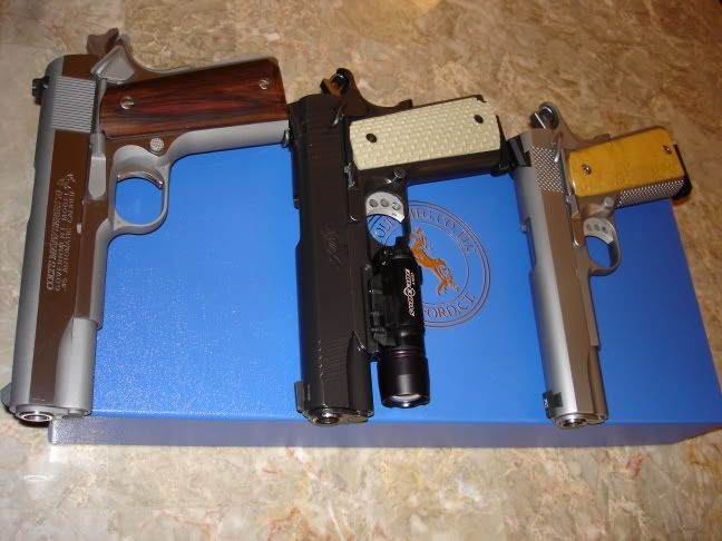
|
|
|
|
|
[#16]

|
|
|
|
|
[#17]
I was referring to the "later models" that have the full host of large roll marks, the horsey mid-slide AND the little one on the thumb safety. I will however, take that smackdown of yours gracefully. Definitely subtle and classy. 
|
||
|
|
|
[#18]
All in good fun! |
|
|
|
|
[#19]
I wish they'd drop all the names and just put the Texas logo on both sides
|
|
|
|
|
[#20]
Mine is non magwell grips on a magwell gun.
|
|
|
|
[#21]
...and yet the Ed Brown "Snakeskin" is one of the most comfortable yet "grippy" designs. I absolutely loved it on the one Ed Brown I owned. |
|
|
|
|
[#22]
These are ugly:
 
|
|
|
|
[#23]
I don't know why, I've always disliked the slide serrations Kimber uses. I also don't like their pretty girl cursive logos either.
Pachmeyer or whatever wrap around rubber grips. If you want to ruin the look of your 1911, that's the quickest way to do it. I know they're functional, but I do have to draw the line somewhere. The non S&A mag well. You know, the one that clashes with the mag wells natural lines. Wilson uses them exclusively. Para's slide serrations, and the look of their high craps. Seeing "Made in Brazil" on Springfield pistols. Aside from that, I think they have the second best looks. Nothing to "purdy" but still highly functional. Caspian railed frames with their built in mag well guide. Yuck those things look horrid. External extractors. I honestly think they take away from the looks of the gun. Flat triggers. I think the best looking 1911's I've ever seen are Rock Rivers. The pictures on the internet don't do the pistols justice, where as every other manufacturers pistols look worse in real life. |
|
|
|
[#24]
That's fuglier than a catcher's mitt filled with foreskinCongrats Kimber, you actually made it possible to say a 1911's uglier than a Glock! (TWO actually) |
|
|
|
|
[#25]
Uh, I guarantee those are custom jobs done somewhere OTHER than Kimber's Custom Shop. |
|
|
|
|
[#26]
Springfields look like ass, IMO. I like Colt rollmarks, except on the Series 80 guns. My favorite marks are the Commercial markings from the 60s. Baers markings are OK. Kimber is blah, especially the stuff under the ejection port and the cheap ass engraving on the frame.
|
|
|
|
[#27]
Does that include the "butt ugly" grips ? 
|
|
|
|
|
[#28]
ACK! I'm going to try pouring bleach in my eyes to get rid of it... |
|
|
|
|
[#29]
[vomits into nearby wastebasket] That's not just "ugly". That is the result of a deliberate attempt to offend us. |
|
|
|
 Win a FREE Membership!
Sign up for the ARFCOM weekly newsletter and be entered to win a free ARFCOM membership. One new winner* is announced every week!
You will receive an email every Friday morning featuring the latest chatter from the hottest topics, breaking news surrounding legislation, as well as exclusive deals only available to ARFCOM email subscribers.

AR15.COM is the world's largest firearm community and is a gathering place for firearm enthusiasts of all types.
From hunters and military members, to competition shooters and general firearm enthusiasts, we welcome anyone who values and respects the way of the firearm.

Subscribe to our monthly Newsletter to receive firearm news, product discounts from your favorite Industry Partners, and more.
Copyright © 1996-2024 AR15.COM LLC. All Rights Reserved.
Any use of this content without express written consent is prohibited.
AR15.Com reserves the right to overwrite or replace any affiliate, commercial, or monetizable links, posted by users, with our own.