|
[#1]
hehehe, I'd buy one
|
|
|
|
[#2]
I Like that idea.
|
|
|
|
[#3]
I'm in for one!!
|
|
|
|
[#4]
I`d take one
|
|
|
|
[#5]
I am down as long as the price is not insane.
|
|
|
|
[#6]
+1 As for ideas... I like simple. We've got a few hats at work with green feet imposed over the big dipper. I think a lower with Team Alaska and a Big Dipper on it would be great. ~Dg84 |
|
|
|
|
[#7]
I'd be in.
Idea: Outline of the State with "Team Alaska" inside it. ~R |
|
|
|
[#8]
id take another AR lower
|
|
|
|
[#9]
I would buy one too, as long as the lowers are engraved by Jon at Anvil Arms.
I have always liked this logo. I think the Alaska Flag with the stars on it would need to be present. how about text? Alaska Defense Carbine Club? Alaska Defense Rifle Club? Alaska Defense Team? 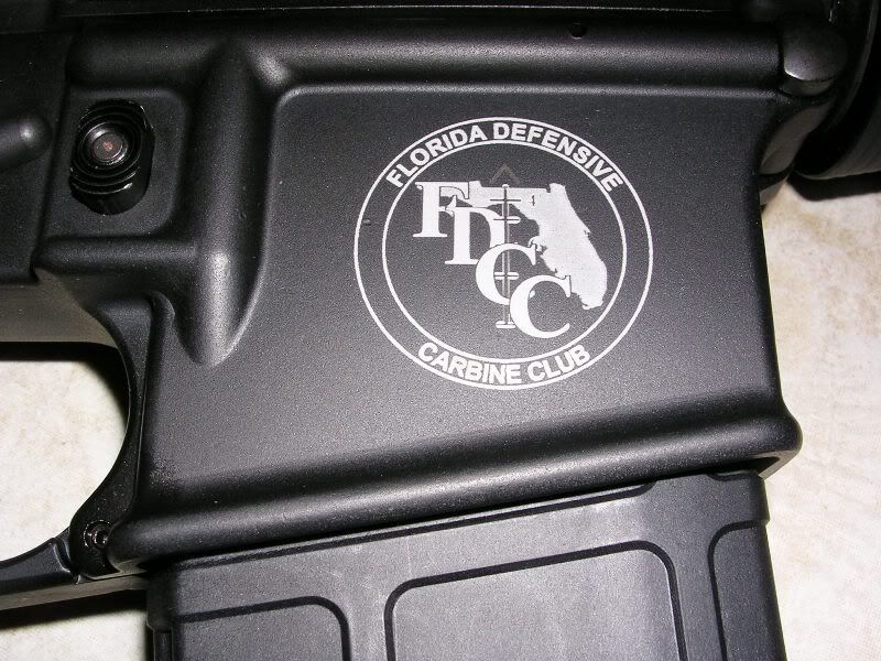
|
|
|
|
[#10]
Can out of staters get in on this? I'm from AK and moving back...
My father, a few friends up there and myself would definately be interested if you all would allow me to be in on it. ETA: If you guys want it, cooked this up real quick... 
|
|
|
|
[#11]
I'm in if we can keep prices resonable...
Maybe when we divvy out the lowers we could have a shoot? |
|
|
|
[#12]
I can tell you anvil arms is top notch stuff , it would be nice to have another Anvil Arms power that i can SBR
|
|
|
|
[#13]
Id buy one for sure. Im sure i could find some other interested parties out here in Bethel
|
|
|
|
[#14]
Hi Ken
I don't see any reason to exclude you and yours. But that's just me. ~R PS. I like what you offered up. |
|
|
|
[#15]
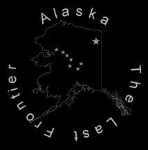
AA does do good work. Personally I like the state outline w/ stars. I'd rather it not say AR15.COM or anything like that; I think it looks silly. But perhaps a good Alaska slogan would be appropriate as has been suggested.
|
|
|
|
[#16]
How about the State Motto?

|
|
|
|
[#17]
"My State is bigger than your State"
|
|
|
|
[#18]
I'm just being silly on this one, but I had to do it. Just cant resist it because........

|
|
|
|
[#19]
Yep that be true but lets let the Texans do the bragging as false as it is. Alaskans, don't need to brag. We know the facts! ~R |
|
|
|
|
[#20]
I'd be interested in an Alaskan Lower depending on price.
Took the liberty of drafting up a few more quick ideas using Camo_ken's pic (went with a 'Last Frontier' theme). Did them on black to get a better idea of how they might look. (I can modify as desired, fonts, text, size, etc) Option #1 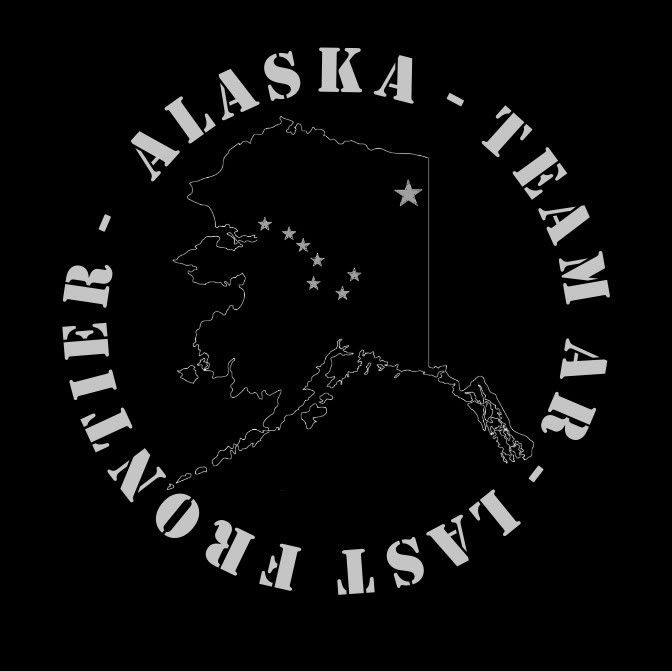 Option #2 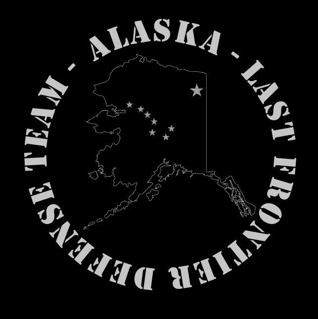 Option #3 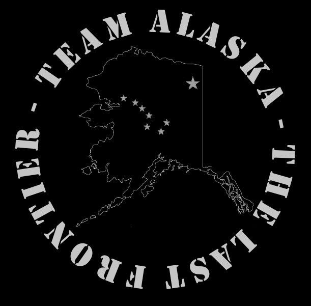 |
|
|
|
[#21]
So far i like "north to the future" the best. possibly "Alaska" over the outline and the motto under in a circle. Lets please keep it simple. What "team" anyway.
I do think it would be cute if they could be marked as model "AK15" or have serial numbers that have "AK" in them. Anybody have a rough idea what this will cost? If it was around $150 I'd be in for two. Over $225 would be real hard for me to get behind. |
|
|
|
[#22]
Drop the "TEAM" off option #3 and it's a go... Ok, even with the "TEAM" on option #3 it would be a go.
~Dg84 |
|
|
|
[#23]
I was wondering about the Team thing...just went with what people had suggested so far. I agree...better to keep it simple. I'm just trying to whip up some draft ideas based on what people suggest while I have time this evening, so open to suggestions.
So here's a couple with the suggested edits: Option #4 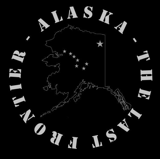 Option #5 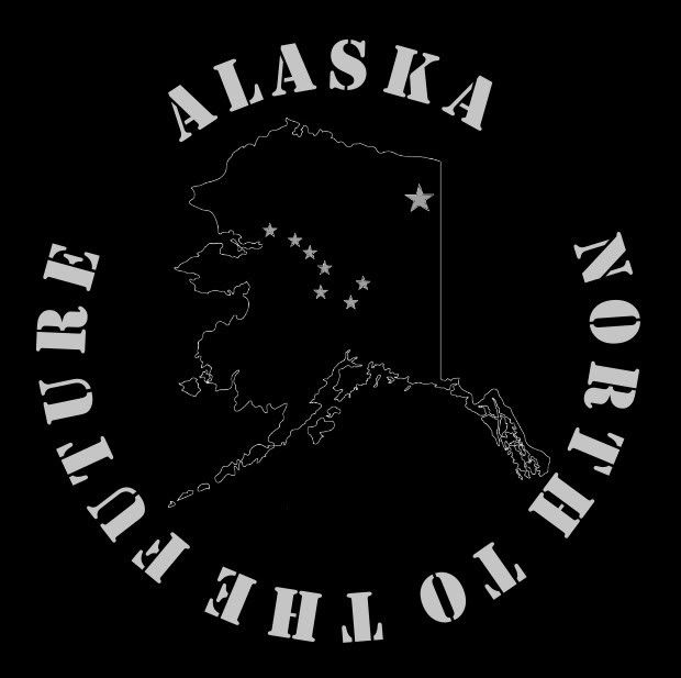 and here is Option #5 in a different font, which would probably work better as it would be a smaller image in a receiver. 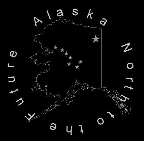
|
|
|
|
[#24]
The Drafts keep geting better and better.
4 and 5 are looking great, 4 the best so far. |
|
|
|
[#25]
Okay, so here's Option #4 with a different font, and in a smaller size, which gives us a better idea of how it may look shrunk down to receiver size.
|
|
|
|
[#26]
Greetings Gentlemen,
Jon With Anvil Arms here. We have our own in house laser engraver and over the last 2 years have done many special projects such as what you guys are discussing and we have had outstanding results. Our lower receivers are regularly $145 but are on sale for $100 at this time. The quality is excellent. We have several of our units in Alaska already. Shipping to AK is our actual cost, we do not add anything at all. We just sent a box of 21 receivers up there with a 16" HBar barrel and the cost was about $30 if I remember correctly. Take a look at our ARFCOM industry provider section (A link is below) for a couple hundred pictures, most of them with laser engraving. The picture of the receiver with the FDCC image (above in this thread) is one of ours we did for that group some time ago. If your in need of other AR parts we have everything from a detent spring to the complete gun. Our LPK's are very high quality, you can read reviews of them right here on this site. We would be happy to work with you guys on this project. Jon Kruger President, Anvil Arms LLC Lakeland, FL. 863-398-4460 Proud ARFCOM Industry Partner Lifetime NRA Member Email: [email protected] www.AnvilArms.com |
|
|
|
[#27]
#4 is sharp... I think I like the bigger font.
Just brainstorming here... What if the dashes between "Alaska" and "The Last Frontier" were replaced with Bear paw prints. I'm not sure how that would turn out once engraved though. Just a thought, ~Dg84 |
|
|
|
[#28]
Wow...Thanks Jon! Just looked at the Anvil site...looks likes some good pricing on the engraving!! With a little work (have to thicken the lines on the map for sure) I could probably put together an imagine in the proper format.
How's this doorguuner? 
|
|
|
|
[#29]
Now that, I like. I think that's the best one so far skeeter. |
|
|
|
|
[#30]
Thank You. I like it too...the bear paws make it pop. I'm just being the geek and putting together the ideas everyone else is feeding to the thread.
 I'll start working on getting a better image of the state of Alaska (per Anvil's web site format suggestions). In case folks are interested in using one of those designs. (Can always do more tuning and changes.) Here's a more refined version, in smaller size, well call it Option #9 (The Alaska map outline is cleaned up as well as the stars.) I'm calling it at night...darn BRD...up until 0300 playing with designs for another receiver. Comments welcomed! Option #9  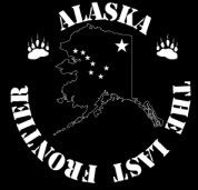 One more before I go to bed Option #10  Option #11  Option #12 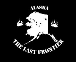
|
|
|
|
[#31]
<----------gives you the ball. Run with it bud, I lack the technical knowhow to do anything beyond MSpaint. I just really want one if they are going to be close to that. |
|
|
|
|
[#32]
SkeeterEater, I like option 10 there. It would show up best on a lower. Jon has the ability to hatch it, so it can also come out looking as a psueo gray color.
My father brought up the 21 lower order that was refered to above. I will have to check if he is wanting to do another. I am almost afraid to do a group buy here though. My dad and Jon with Anvil could be swamped with orders. |
|
|
|
[#33]
#11 . Thread over .
|
|
|
|
[#34]
I love #9 !!!!!
I like the line drawing of Alaska instead of it filled in. I'd be down for several. I am sure Greybear in Chugiak would broker the deal..... Here's a pic of a lower Jon engraved for me.  Jon did a lot of work to get this right, but did not charge any extra! Jon, could we get "AK serial #'s? |
|
|
|
[#35]
When your setting up the image remember a couple things...
The area is only (Roughly) 1.4" x 1.4". If you put text above and below your image the image is going to have to be pretty small, and likely the text as well. The smaller the image the more detail you loose. For shipping it would most likely be much less expensive to ship a bulk order to one point up there and then have that dealer ship to individual dealers. It has got to be less $ to ship within the state small orders than to ship a bunch of small orders from here. We are currently taking orders to be shipped on/about the 10th of next month. We can send receivers stripped, with LPK installed and with LPK and stock installed. See Anvil Arms Lower Receivers for pricing details. Any questions, please feel free to ask! Jon K. |
|
|
|
[#36]
Thanks for the update Jon.
Anvil makes some real nice lowers. The engraving on our last order came out real nice. It's also awesome being able to talk to someone who owns the company and has interest in it, versus just a salesman.  ETA: included image |
|
|
|
[#37]
SkeeterEater, can you do some to scale of 1.4 x 1.4 to see how much actually shows?
|
|
|
|
[#38]
Question for Jon @ AA:
If I wanted to add a name, initials, member name, etc. to my specific receivers is that possible? Also if members want can they get these stripped, with a LPK, LPK & A2, etc. |
|
|
|
[#39]
TeamAKXXX for a serial number would be the tits
|
|
|
|
[#40]
Yes, yes it would |
|
|
|
|
[#41]
Hard to post pics so you can view them at a specific size on everybody' s screen. Here are smaller, roughly the same size, versions of the 3 main options that folks have liked so far. (On my system with my software the image size is less than 1.4 inches so they should be fairly small and for some reason #11 got a little fuzzy when I shrunk it.) It doesn't look like I have the ability to put them in the Corel Draw format that Anvil prefers, so it would probably be best to send a larger version to the outfit Anvil recommends on their site, and have them do the trace to insure it's nice a clean. I'm sure Jon can advise us on that. (Thanks Jon!!!) Option #9  Option #10  Option #11 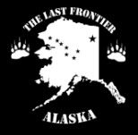
|
|
|
|
|
[#42]
I like #10 but this is not a coin so could you make all the letters right side up like you did in #11?
~R |
|
|
|
[#43]
Just so happen to have a version like that sitting here. How's this? We'll Call this Option #12 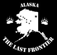
|
|
|
|
|
[#44]
A+ |
||
|
|
|
[#45]
|
||
|
|
|
[#46]
Here's on with the paws a little bigger in different positions and with the text a little tighter to the image.
Option #13 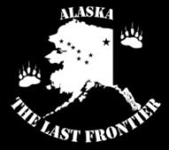
|
|
|
|
[#47]
#12 Would be my choice as well
I call dibs on SN last 3 of 049 |
|
|
|
[#48]
I like #12.
This just keeps getting better and better. I hate to be a pain but can we get the lettering a little larger or something so it fills more of the gaps in the circle of lettering? Like you did in #10 Sorry. |
|
|
|
[#49]
I was thinking the same thing earlier but didn't want to seem picky... I think this is money! ETA: Maybe, if anything... "ALASKA" should be a bit bigger font. |
|
|
|
|
[#50]
picky picky picky |
|
|
|
 Win a FREE Membership!
Sign up for the ARFCOM weekly newsletter and be entered to win a free ARFCOM membership. One new winner* is announced every week!
You will receive an email every Friday morning featuring the latest chatter from the hottest topics, breaking news surrounding legislation, as well as exclusive deals only available to ARFCOM email subscribers.

AR15.COM is the world's largest firearm community and is a gathering place for firearm enthusiasts of all types.
From hunters and military members, to competition shooters and general firearm enthusiasts, we welcome anyone who values and respects the way of the firearm.

Subscribe to our monthly Newsletter to receive firearm news, product discounts from your favorite Industry Partners, and more.
Copyright © 1996-2024 AR15.COM LLC. All Rights Reserved.
Any use of this content without express written consent is prohibited.
AR15.Com reserves the right to overwrite or replace any affiliate, commercial, or monetizable links, posted by users, with our own.