|
[Last Edit: Former11BRAVO]
[#1]
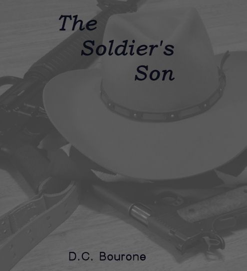
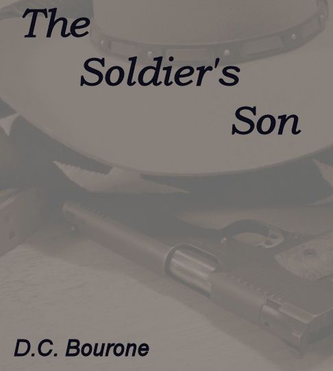
I'm inclined to suggest something like this.
ETA: Respectfully. 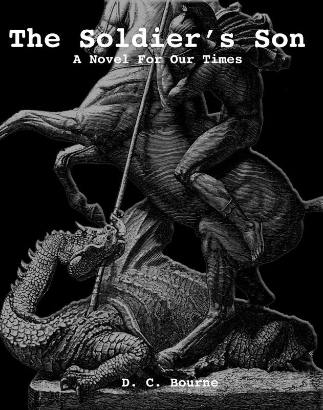 </a>" /> </a>" />
|
|
|
|
|
[#2]
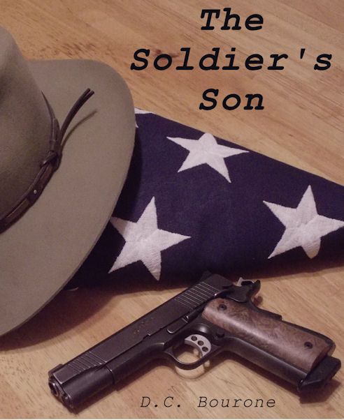
Humbly submitted for review and crushing opinion.
I tried a couple itinerations - attempting to incorporate other elements into the design, as suggested. The above submission was by far my favorite, however. I feel it's simple, straightforward and, if I may say so myself, kinda elegant. (I bet it'd look great in high-gloss, on a paperback!) Of course, YMMV. It's just an idea I had and I offer it as a token of my appreciation for your hard work and graciousness in sharing your labor of love with us. Feel free to use or discard it at your leisure, DCB. Thank you. |
|
|
|
|
[#3]
Originally Posted By Former11BRAVO: I'm inclined to suggest something like this. ETA: Respectfully. http://<a href=http://img.photobucket.com/albums/v413/dannyboy39/Soldiers%20Son%20Cover.jpg</a>" />  |
|
|
|
|
[#4]
Originally Posted By DesignatedMarksman:
This is excellent, except his last name is Bourone Originally Posted By DesignatedMarksman:
Originally Posted By Former11BRAVO:
I'm inclined to suggest something like this. ETA: Respectfully. http://<a href=http://img.photobucket.com/albums/v413/dannyboy39/Soldiers%20Son%20Cover.jpg</a>" /> Eh. Minor details.... Who got time fo dat? |
|
|
|
|
[#5]
--Kermit, have been watching the "Survival: After It Happened" dude very closely. This is "The Competition" --and it is competition, brutal competition, for the first 20 slots/places on the 1st page of subcategory "Kindle top 100 post-apocalyptic"--the 20th place, at the bottom of the page, generally trends around 1000 overall on Amazon. There are websites/authors that test Amazon Kindle rank to sales per day on a constant basis--"1000" used to be about 100 sales a day, this metric now not quite so useful, because a "borrow" on Kindle Unlimited, now equals one sale in the ranking, EVEN IF THE BORROWER ONLY READS ONE PAGE--and KU now pays less than 1/2 of once cent, per page read, and only per pages read. So KU is good for ranking which equals visibility which equals borrows/sales--but not necessarily income. But let's approximate rank of 1000 equals 100 sales a day. At 2.99 the author keeps about 67 cents per dollar--say .70, so 2.10 per sale, or 210 dollars a day, 6300 a month. Not chump change, but not "rich" by any means. The "Survival: After It Happened" dude did a ton of things right, obviously. The cover is perfect. He put three books out within six months. The books are short, light reads, roughly 200 pages or slightly over. 200-250 pages at 2.99 is the maximum price/length ratio--sales drop precipitously after 2.99, particularly for indie authors. 2.99 is the break even point at which Amazon pays approx. 70 percent per sale, below 2.99 the writer gets 30 percent. I am intrigued by the fact that his books take place in Great Britain-- an interesting twist on a genre which is almost exclusively a U.S. phenomena. This author is the break-out success in the genre, so far this year. And if nothing else, he is a compelling argument for good/professional covers. Other than the broadest definition of genre, however, I don't know how much my readers, and his, will overlap, although his appearance in Injured also-boughts is promising. Kermit I see a latent art director/production designer in your cover suggestion. I am generally pretty wary of 'marketing'--but I've been studying this genre for two years now--check the top 100 and top 100 postApoc releases several times a day. For instant recognition, dude/gun/silhouette/maybe flag seems to rule. I'm still looking at cover artists every day. RANDOM NOTE: a bunch of post-apocalyptic fiction is now being written by women/romance-writers/ex romance-writers cashing in a much smaller, therefore easier to penetrate, market. I find their efforts generally unconvincing and inauthentic. Stepping lightly, I hope. --Former11b I don't think any cover idea here has as much appeal so far as some iteration of St. George and the Dragon--my fear is that in the ocean of available postA stories, St. George suggests subconsciously George Martin Game of Thrones/fantasy/etc. As a back-handed compliment, I think there might be some severe normalcy bias on this forum. This is an extremely literate bunch of readers/poster. I suspect the number of Amazon readers who have more than the most cursory understanding of St. George is...small. --DesignatedM, very nice to see you. The Bourne thing...Former11b is forgiven, I am still a their/there dude, and....I know better. |
|
|
|
|
[Last Edit: PFunkk]
[#6]
Originally Posted By Former11BRAVO:
I'm inclined to suggest something like this. ETA: Respectfully. http://<a href=http://img.photobucket.com/albums/v413/dannyboy39/Soldiers%20Son%20Cover.jpg</a>" /> That's bad ass. If you could throw a mushroom cloud in there, that would ruin the fantasy/weird thing??? I know jack shit about marketing, but the scarecrow creeps me out and the statue is FFFING awesome. Edit/ spelling |
|
|
|
|
[#7]
PF/Former11B/all, yep that statue is totally awesome!!!! It is one of the images I studied/grew up with/embedded in my brain, long ago. The history/meaning of St. George extremely appropriate for the Gehrs, they would not choose such a symbol lightly, fair to say they don't do anything "lightly", and never will. PF if the scarecrow "creeps you out" that is a version of "good." And over here at my place the contest between perfect, and good, is savage, and "good" needs to win more often. Also your comment reminds--- nuclear mushroom cloud....hmmmm....another option that might have to be investigated. Generic mushroom clouds even more cliche than "dudes with guns"--problem is---Ok, in mind of Amazon browser--one thing nobody ever wants when 'shopping' is a 'surprise'--particularly an unpleasant one. Hence McDonalds, Chilis, and every other chain merchandising you can imagine. This story stretches the genre to an extreme---perfect so far for this audience---unknown for 'out there'-- my job eventually is to attract/seduce/tempt enough "other readers/unknowns" to eventually have a market. Blah blah blah....blah blah blah, etc. etc. etc. So much fun!!!!!! |
|
|
|
NV, USA
|
[Last Edit: Trapshooter12]
[#8]
There was an article about open carry in Texas and the picture for the article showed a guys leather holster with the state of Texas on it with a Minute Man in side ofTexas I thought of your cover when I saw it.
Maybe something like that with a mushroom cloud behind it. |
|
|
|
[#9]
Originally Posted By DCBourone:
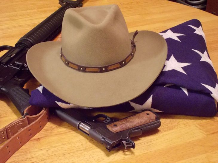
General Note: EDIT: a wise man here commented on the amateurish composition and content of this pic, with considerable merit. So I hasten to add--this pic contains "elements" of a possible cover. In other words, hammer/mask/flag/possibly weapon. The intent here is for a professional cover designer to extract from these elements several/many possible covers, which will likely/hopefully 1. Be professional/look professional 2. Satisfy the "recognition factor" of the Post-Apocalyptic genre, etc. THIS SHOULD NOT BE/WILL NOT BE THE ACTUAL COVER Outside/off of this forum, in the wild's of the Amazon, this story competes with hundreds, perhaps thousands, of "Post-Apocalyptic"/Prepper/Zombie/Plague/And One Bazillion EMP novels. The genre tropes ( flag, suggestion of a weapon )/mask/hammer are general attempts in the direction of "what might be recognized" by the legions of non-forum members who are just browsing for their next fix. If I could do many different covers, I would, and virtually certain that the ideal AR15.com cover would be considerably more abstract, artful, and suggestive, rather than so on the nose. Several Wise Men have suggested the St. George and Dragon. Seriously, no harm no foul on ridicule, dismay, and horror at this pic. If you want to see the covers in the genre with which this MUST be identified, just search "Kindle Top 100 Post-Apocalyptic"--and you will see as many as you can stand. For the eyes here, and there are many, see these problems, which are many-- 1. The hammer needs to be hooked over the shoulder 2. The mask, narrower, an easy fix. 3. The tan chest is incongruous, distracting. 4. The exposed wrists are distracting, as is the open cuff. 5. There is no place for text, without confusion... 6. The figure does not fit "Son" as seen, fascinating the way the mind intuitively understands/creates "scale"-- and that would be correct, the pic is me, with stuff lying around, and I am 6 feet, 200 lbs. The Deputy, perhaps, but not his son. 7. I like the glove, should do the other-- Comments welcome, as usual--pic follows here by 11:30 PM central, Ok, maybe not, FF. Pic needs to be smaller, more evocative at E/paper back book size--http://i.imgur.com/Ykqa7vA.jpg HA! Pic has TWO hammers 
Love the gloves. If you put a hat on the figure you can leave just the chin showing in shadow with a skeleton mouth, removes the eyes problem and adds mystery. The other thing you can do is polarize the artwork. I have to do this every year for my FAL match shirts. You take an image and then manipulate it to be only 2 colors. It takes some clever editing and time, but can be very effective. Here's an example... 
This is a shot I stole from a gopro we had hanging on a barricade. It's a good friend of mine who has since passed, but I was able to edit out the range, me standing in frame over his right shoulder, convert from color to monochrome, and still keep the determined look in his face. Make it an svg and it is infinitely scaleable. I think the boy with his arms crossed, hammer in one hand, pistol in the other, stetson on, and just the chin showing the skeletal smile, in monochrome, would be nice. |
|
|
|
|
[#10]
New pic below, remember...elements only--
--trapshooter, I remember that picture. Still trying to figure out a way to work the nuke in, can't come up with any image that isn't too cliche/on the nose/cartoon like. This is where a pro cover designer come in, at some point-- --stimpsonJ, two hammers indeed!!! You will appreciate, that is old STG kit spun up on Imbel many years ago, rail/Aimpoint added, sighted in, and stored untouched until like...yesterday. Shame shame shame. Your design Son/mask/pistol/hammer and stance looking down, I have version same, this is very very likely. Your notes on color/negative/reductions are all possibilities--glad you like the glove, interesting: the hammer length/angle and pistol, held crossed on chest, are somewhat "incongruent/dissonant"--but possible, they look best held very close together--will put that pic up after revision this weekend I hope. Kermit's recommendation of "After it Happened" a good guide for "what works"--it is a pro-picture/cover, lots of depth, typical dude with rifle, staring into dusty misty distance, note THAT IT SAYS NOTHING ABOUT CONTENT OF STORY, EMP OR PLAGUE OR WAR OR ZOMBIES--it just says "this is a professional cover in this genre, same theme as most of the other covers, but just really well done ( and oh yeah what is that dude staring at and what happened ) Ok pic follows here: The Good about this pic: tons of dark to write title against. Not on the nose. Glove is abstract but creepy, invites another look. The Bad; too amateurish, obv. a pic, zero shading/texture/depth--  |
|
|
|
|
[Last Edit: DCBourone]
[#11]
error
|
|
|
|
|
[Last Edit: DCBourone]
[#12]
error
|
|
|
|
|
[#13]
DC, checking in. For your cover, how about the soldier's son in the get up you are working on in your picture on the horse slaying the dragon? Instead of the spear, he could be wielding the FAL, wearing the mask. etc. Done correctly I think that could tie your themes together nicely.
|
|
|
|
|
[#14]
--seelbo,--very pleased to see you--and now you too have tangled with the near infinite
number of elements one might crowd onto a cover. A concern with horse/dragon/modern weapon/modern accessories would be the suggestion to the one second Amazon browser of steampunk, or related fantasy. Another issue might be that everyone here, who has lasted this long on a very...very...long, and often delayed, thread,--knows the story extremely well, characters, themes, images--and is "building the cover in reverse" so to speak. I/we/you/us are hoping to justify a cover based on a book we have already read. But the blunt crude purpose of the cover will be to just make new, possible readers comfortable enough to read the sample, reviews, hopefully buy. The most important factor is first, and unfortunately, comfort--as in "I am pretty sure what this is, I like this genre, I am searching this genre for my next read" and so on." If you ever want to see the essential value of recognizable covers, take a look at romance. For instance, I really want to use the mask/a mask--but unless managed balanced really well by other elements, the mask suggests basic horror, which PFunk alluded to. He is correct. Some creepy is good, too much creepy could be very ungood. |
|
|
|
|
[#15]
If you ever get a pic you are happy with I will try to monochrome it for you. |
|
|
|
NV, USA
|
[#16]
Another thought.
I liked the idea of the Cowboy hat with the lower part of the face painted as a skeleton and the Skeleton gloves. Maybe throw in a Badge on a table and a gas can. Maybe some blood on the badge. |
|
|
|
[#17]
Not necessarily a vote, but I like the 11B cover.
|
|
|
|
|
[#18]
The glove picture is better than the scarecrow picture. If there were blood on his hands that would be even cooler.
I'd still like to see Maria Elizabeth naked on a horse... with a gun. (She would have the gun, not the horse). Or the horse could have a gun too, a saddle mounted MG 42? Go big or go home, ya know? Bam!! In your face!! Read this book!! Keep on |
|
|
|
AZ, USA
|
[#19]
Variation... 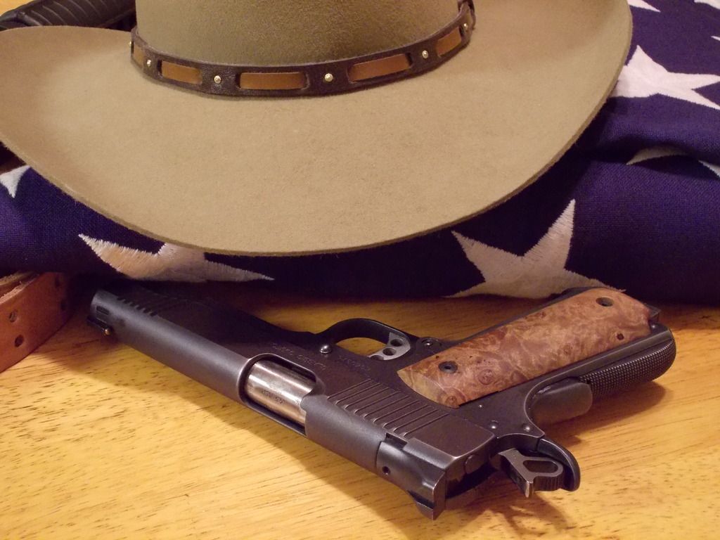

|
|
|
AZ, USA
|
[#20]
|
|
|
|
[Last Edit: greyguy]
[#21]
I like this. Maybe with a well worn deputy's badge and a coin with St George. You might replace the AR with with an AK since that is what he used at the cantina. I may be suffering from the familiarity bias that you described DC but I think that something like this would get the point across... |
|
|
|
|
[Last Edit: PFunkk]
[#22]
Originally Posted By kermit:
http://i732.photobucket.com/albums/ww326/kermitphx/DSCN1991%20title%20crop%20color%20resize_zpsxe12uzlw.jpg No, just no. ETA: That wasn't very polite. Me trying to be polite: That cover art is tasteful and classic. It doesn't appeal to me personally , but your willingness to assist the author, and your eye for symbolism is outstanding. |
|
|
|
AZ, USA
|
[Last Edit: kermit]
[#23]
No worries PFunkk.......I wouldn't put something out in the public domain (especially ARFCOM!) without the expectation of constructive criticism and differences of opinion. Let it all hang out. This is Liberty Hall; you can spit on the mat and call the cat a bastard.
Greyguy: I don't own an AK, and my personal opinion is that I don't like the juxtaposition of a combloc weapon with the American flag....especially a casket flag. I went with an easily recognizable rifle and the intention of cropping the picture down to where only a few elements of the rifle were still visible. The final product of variant #1 really only showed a small piece of the M1917 sling and a bit of the handguard, making them into more of an easter egg for sharp eyes than a focal element of the image. The one with the bigger view of the AR didn't appeal to me as much but I included it as a possible variation and to show where the thought process started. The badge and St. George coin are great ideas, but I had the same problem there....I don't own a badge or a St. George coin, and didn't have an easy way to acquire either of them after dinner last night. A question for DCB: in the e-publishing environment, are you able to rotate covers the same way that blurbs can be rotated? I know my covers are different from the mask/hammer/glove covers, and that's on purpose. My thought with these designs was that there are possibly more readers to "steal" from the Tony Hillerman and 'Longmire' readers than there are from the killer clown zombie readers. I like the mask/hammer/glove covers and they reflect certain elements of the story very well, but this group recognizes those elements because we've already read a good portion of the story. To the potential reader who only has the cover and the blurb to go on, it presents the immediate thought of Heath Ledger as the Joker or 'Killer Clowns from Outer Space" (that's a real movie...google it). In the end its' DCB's book and DCB's decision. All the rest of us can do is throw stuff at him and see what sticks. Edit to separate the replies to PFunkk and Greyguy |
|
|
AZ, USA
|
[#24]
LOL....I have 63 other variations of arrangement and lighting that I can get into if you want.
More focus on the hat: 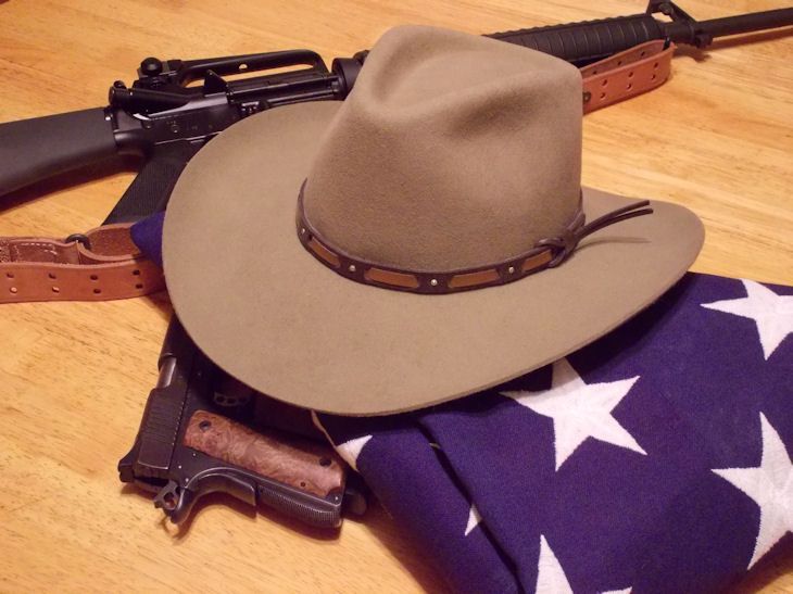
Dark, intended as a background instead of the primary image: 
|
|
|
|
[Last Edit: stimpsonjcat]
[#25]
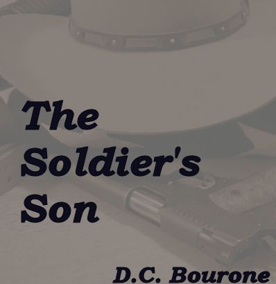
Here ya go...
Original
Monochromed 
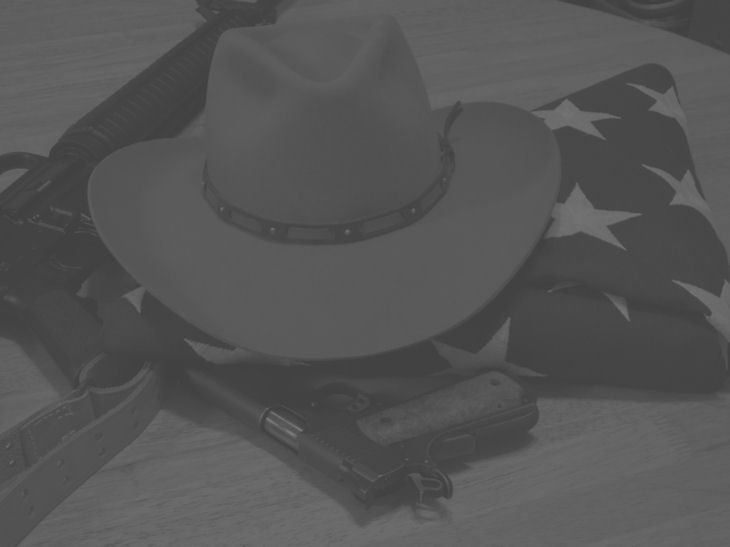
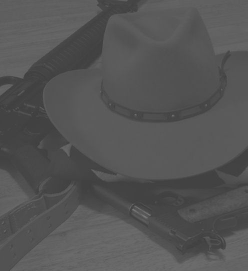
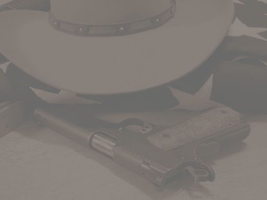
15 minutes or so, and 10 of those was finding an appropriate font to use for the text. This is meant to be a demonstration of the technique, and not necessarily the actual content..apologies to kermit for ripping off his image. |
|
|
|
|
[#26]
Ok here's some more late night ramblings of a senile old guy:
In my mind the overall setting in TSS is impending anarchy/ social upheaval. A google search for the symbol for anarchy shows an A transposed over an O (anarchy is order). I would suggest a ring of fire forming the O, and an AK, FAL, and AR15 forming the A in front of one the previously posed pics, probably former11B's or possibly the glove pic. If I were half as tech savvy and artistic as some of you guys, I would whip this right up but sadly, I ain't |
|
|
|
AZ, USA
|
[#27]
I like where you're going Mr. Cat.......and picking a font was frustrating for me as well.
Feel free to hack/modify/improve as you see fit. |
|
|
|
[#28]
GENERAL NOTE: cranking along in the wee hours. DEADLINE APPROACHING. Will try to post as often as possible, hopefully once a day, to prove that I am alive and working. GENERAL NOTE: Post publication, reviews help tons. Almost every one here HAS ALREADY POSTED A BEST POSSIBLE REVIEW IN THEIR GENERAL COMMENTS. For those of you who KNOW you want to post a review, think about past "awareness/ideas/comments" you have made. More on reviews later--planting a seed now--THE REVIEW IS LIKE THE COVER, the only job of the review is to "move the eye/mind forward"--more on this later-- SEE INDIVIDUAL COMMENTS: --StimpsonJ very pleased to see you! Offer assistance noted! Two Stg kits and Imbels in the grease, untouched for....longer than I care to say! (....meaning...I think it is time for me to get this fffing show on the fffing road, and I know everyone here would agree....) --trapshooter--hat, skeleton face, skeleton gloves, gas can--you have embraced the chaos of infinite options, and it is a very dangerous place, I live here, I warn you...I warn you....watch your step. Your cover goes in the category--how many covers can be made? Can covers be shuffled/changed? Yes they can, more below. --wingsnthings, yes understood, that would and always will be a/the favorite cover of this board, but I will always fear we are a small small minority of very alert readers/observers/historians etc. See the cover of Injured? A single stroke of calligraphy, mine, with a digital wand--the wake of the boat across the night, a scar, a cut through darkness--suggests everything to me, means nothing to pretty much everyone else. Injured would sell ten times more if it were a bleeding Nate or Billy or Morales staggering across a beach with a weapon blazing. But there is an upside: For Injured Reserves, I do not want those readers. A few bought it by mistake, posted uncomprehending reviews, one and two stars, let us say, speaking charitably, they were baffled. We shall see. --PFunk, understood on scarecrow--it is "too scarecrow" like, and less "going to do something required" this will be fixed, hopefully, in some future iteration. Maria on a horse....I wish. Maria nude on a horse with an Mg-42....I double wish, and if I were present for that picture, I would not make it home, and neither would Maria, her interests notwithstanding I would press my case, and this book would never get published. --Kermit. Kermit. I see you have stepped hard into the fray, guns blazing, blades swinging. Your cover schemes are straight into the heart of "A Genre" of cover. Resurrecting your note on "After it Happened"-- here is what we are looking at...."studies show" (loathsome cliche often hiding hard truths) that covers with a human being/figure severely outsell non-person covers, many exceptions of course--but for an indie writer, with only the readers here to "prime the pump"--I need every conventional 'trick' there is. The cover of "gone girl" is...waving hair against the dark? Photon trails? Who the F knows. --Kermit, how long did it take you to set those up? And...thank you. --PFunk thank you on Kermit and yes that was an awesome pitch he made. --Kermit yep this is no place for shrinkers, fairies, daffodils, mincing prancers, prancing mincers, the whiny, the irresolute, the shiftless of thought, the illiterate. Ak against flag, yes, very dissonant. Casket flag, brilliant, I have one, only we know what it is. St. George, we know the issue(s). Stealing from Tony Hillerman and Longmire, aha, very wise, had not thought of that connection. Mask as Joker, oh yes a problem. Mask must be counterbalance by flag/weapon/stance/title/blurb. Ok see everybody tomorrow night. DCB |
|
|
|
|
[#29]
--StimpsonJ oh yep I see your post now--the monochrome actually "renders like a book cover"
Kermit's pic, for instance if just the 1911 and bottom of hat is clipped for cover--that is a functional cover. Also the mottled writing says--someone made a cover effort here-- a huge response to covers is simply a subconscious recognition--Ok this is a professional cover--means some effort made--means might be/could be/should be a professional book ( in other words not completely illiterate ). |
|
|
|
|
[#30]
Oh wow catching up-- --Piddler!!!! Ok Piddler hang on, next 24/48 have pic to post of your book ingredients: silver dollar, black leather, .45 casings to make plugs/ridges or maybe brads, don't know yet. --Ok Kermit on Piddler--listen Librarians, Ok, really I need time to write book on normalcy bias for literate Arfcom members--Ok, guys. Guys. Stepping lightly: WE ARE NOT FUCKING NORMAL. WE ARE A TINY EENSY WEENSY PORTION OF THE GREAT WRITHING MASSES. In other words, statistically NOBODY knows/understands/recognizes the symbols/words/themes ideas we take for granted. St. George. Symbols of anarchy. Oh, yeah, the freaking Constitution of the United States of America. And what it actually meant. Even more important: the freaking Declaration of Independence. Remember Radiohack quoting freaking Kipling????? That's us. Not. Many. Others. I've got a long long story here, maybe for a blog someday. "What the FFF I am doing, and why"--that story would directly address exactly this subject. And Piddler you understand, no harm no foul? You know a lot of people like you? ( If you do? Start another country, Ok? ) But I bet you don't. |
|
|
|
|
[#31]
Originally Posted By DCBourone:
--StimpsonJ oh yep I see your post now--the monochrome actually "renders like a book cover" Kermit's pic, for instance if just the 1911 and bottom of hat is clipped for cover--that is a functional cover. Also the mottled writing says--someone made a cover effort here-- a huge response to covers is simply a subconscious recognition--Ok this is a professional cover--means some effort made--means might be/could be/should be a professional book ( in other words not completely illiterate ). It was 15 minutes. It is not fit to front your efforts. But if someone can combine what has been discussed in a photo, I will wave my wand at it. This is a distraction from the effort I mean to make for you...but I see the need before the want. I wish I owned a stetson. Posted Via AR15.Com Mobile |
|
|
|
|
[Last Edit: PFunkk]
[#32]
Kermit,
Thanks for the lack of unnecessary sensitivity. We're on the same team here, and differences of opinion are just that. It's very cool that you're throwing ideas our there. I've thrown out many ideas. Most were probably lousy. Whether your idea sucks ass or is the greatest ever, we're in the same boat. Keep on. |
|
|
|
|
[#33]
--PFunk, in many years of web/forum lurking I have never seen a thread this long with so little
dissonance, so few asshats, fuckwits, spoilers, cranks, or doubting panty-waists. The general vibe "no place for shrinkers, fairies, daffodils, mincing prancers, prancing mincers, the whiny, the irresolute, the shiftless of thought, the illiterate" seems to hold hard. I bet Kermit is anvil hard. I bet most of us are. GENERAL NOTE: if Soldier's does well/better/Ok/great--strangers will eventually find us. That should be....very interesting. I recommend courtesy. Up to a point. Beyond that point...well, fire has so many uses. Ok everybody crash out. This is my time. The Witching Hour. And I don't like share! |
|
|
|
|
[#34]
--ah StimpsonJ, just saw that--no that is excellent and the cover will be an evolution of many many things-- --Kermit, I see your note on "can covers be shuffled/changed/etc." Yes They Can-- inside publishing dope: many books don't sell for shit, a cover change, they become hits. Covers very very very important. Your original comment "When It Happened" book--I am pretty sure the covers, and the speed of publication, are big reasons for that series success. The writing/story is competent but not exceptional. Another reason might be success in Britain--while prepper/post apoca fiction is a known/fairly crowded genre in U.S. I would not be surprised if his books are not common in Brit market, therefore he owns a big chunk/all of that market. |
|
|
|
|
[Last Edit: greyguy]
[#35]
Originally Posted By stimpsonjcat: Monochromed Cool... |
|
|
|
|
[Last Edit: greyguy]
[#36]
Originally Posted By kermit: No worries PFunkk.......I wouldn't put something out in the public domain (especially ARFCOM!) without the expectation of constructive criticism and differences of opinion. Let it all hang out. This is Liberty Hall; you can spit on the mat and call the cat a bastard. Greyguy: I don't own an AK, and my personal opinion is that I don't like the juxtaposition of a combloc weapon with the American flag....especially a casket flag. I went with an easily recognizable rifle and the intention of cropping the picture down to where only a few elements of the rifle were still visible. The final product of variant #1 really only showed a small piece of the M1917 sling and a bit of the handguard, making them into more of an easter egg for sharp eyes than a focal element of the image. The one with the bigger view of the AR didn't appeal to me as much but I included it as a possible variation and to show where the thought process started. The badge and St. George coin are great ideas, but I had the same problem there....I don't own a badge or a St. George coin, and didn't have an easy way to acquire either of them after dinner last night. A question for DCB: in the e-publishing environment, are you able to rotate covers the same way that blurbs can be rotated? I know my covers are different from the mask/hammer/glove covers, and that's on purpose. My thought with these designs was that there are possibly more readers to "steal" from the Tony Hillerman and 'Longmire' readers than there are from the killer clown zombie readers. I like the mask/hammer/glove covers and they reflect certain elements of the story very well, but this group recognizes those elements because we've already read a good portion of the story. To the potential reader who only has the cover and the blurb to go on, it presents the immediate thought of Heath Ledger as the Joker or 'Killer Clowns from Outer Space" (that's a real movie...google it). In the end its' DCB's book and DCB's decision. All the rest of us can do is throw stuff at him and see what sticks. Edit to separate the replies to PFunkk and Greyguy I hear you on the Combloc and memorial flag thing, that makes sense. Maybe if DC just threw the glove in with an assortment like yours it would create enough of a contrast with the more traditional look without attracting too many killer zombie clown fans (love that BTW). Either way I like where you're going with those pics... |
|
|
|
AZ, USA
|
[#37]
DCB - it took about an hour to gather the stuff, shoot the pics, photoshop, and post.
My main issue is a lack of props....I have the flag, Stetson, and 1911, but no badge, coin, or AK. I'm also short on people. If my photoshop skills were better I could just take multiple pictures of myself and layer them, but I'm not that good yet. My wife would be happy to help but a short, round, 50'ish woman wouldn't necessarily attract the type of readers you're looking for. I'm working on a way to recreate the approach to the cantina. Background: two men on a wooden porch, slightly out of focus. Foreground: person viewed from the back, only right arm and part of the hip/torso visible, 1911 in right hand. I'll have to dig out one of my 10 round extended mags to get the 1911 right. Will work on that tonight. |
|
|
|
[#38]
Originally Posted By kermit:
My wife would be happy to help but a short, round, 50'ish woman wouldn't necessarily attract the type of readers you're looking for. Holy crap!! I actually laughed out loud. Luckily I'm at home so just my wife and kids think I'm an idiot. That's freaking hilarious. Well played Kermit. |
|
|
|
|
[#39]
Kermit,
If you take the time to try to do another set of images, be aware of the lighting. As an example note how the front of the 45 slide is mostly undefined in the mono image. Look back at the original and you will see that area is in shadow below the brim of the hat. That is why it disappears in the mono. It is important that any detail that needs to be in the final image be equally lit. I could add a badge from another image. Though it is not in the script per se. IMO we need a lanky 18yo in a button-up shirt with the sleeves ripped off (color doesn't matter, but no pattern) with a 1911 style pistol in the right hand an a big gulp in the left, in the stetson, with one of those biker masks with the skull face on it, tilted down to avoid everything nose and up. Waist up only. The cup can be off and almost out of frame or behind the torso. Torso should be coming toward the camera, but facing more to the camera's right. The pistol ought to be between retention (position 3) and extended. We are seconds from meeting Hector. In front of a white wall would be ideal and save editing time, but I can nuke the background if necessary. It was gunsmith talk.
Soft voices in the dark, on a Texas porch under a Texas sky full of stars. Dammit...that makes me miss the man in the image I posted. Mike was such an amazing maker. Everything he did was better than my fumblings. |
|
|
|
|
[Last Edit: DCBourone]
[#40]
--greyguy yep StimpsonJ monochrome very cool.
--greyguy--what I see here with micro-tweaking of details is an opportunity, a fantastic opportunity.... to whine. Bitch. Plead....because what everyone is doing now, with this cover, is exactly what I do with the freaking text. Every fffffing word, character, pause, inflection, name, whisper, and shout. So I will remind us all as I remind myself....must not let the perfect be the enemy of the good. --kermit one hour, quick quick quick. Layer photo you/wife/etc. max funny. Kermit, consider value of your efforts here as a considerable footnote .re "meaning" for the story--but I will prompt you, context your own reference to "When It Happened" Amazon cover--commerce will almost certainly dictate a "person-like" figure on the cover. StimpsonJ referred a design I have drawn, and have provisional photo, better soon, of masked figure/gloves/1911/flag in background. This or some variation will almost certainly be the cover. --on approach to Cantina--now we see why the pro book cover folks are in business--vast libraries stock images, photo-shop skills, etc. "Best" covers run in the thousands of dollars. The cover artist for "When It Happened" is in Britain, her covers run about 90 bucks, not a problem obv. although the timing might be--my job then to provide as many elements and photo(s) as possible from which she/other would extract a final. Note that the "When It Happened" cover is entirely generic--says absolutely nothing about the story--although later covers are somewhat referential. --PFunk, yep pretty damned funny. --StimpsonJ "We need a lanky 18 (14 ) year old in a ripped shirt" etc.---Yes. Now we're talking. That is drilling down into what the cover will be. Sad but true: a good generic cover would "Sell More" than a bad accurate/evocative cover. Normalcy bias you guys. WE ARE NOT NORMAL. And we already know the story. --Next post: Piddler's book ingredients. This is more for me than anyone--I owe him, and for a long time. |
|
|
|
|
[#41]
 |
|
|
|
|
[#42]
Originally Posted By DCBourone:
--StimpsonJ "We need a lanky 18 (14 ) year old in a ripped shirt" etc.---Yes. Now we're talking. That is drilling down into what the cover will be. Sad but true: a good generic cover would "Sell More" than a bad accurate/evocative cover. Normalcy bias you guys. WE ARE NOT NORMAL. And we already know the story. I will say one of my personal pet-peeves is when the cover art ends up having NOTHING to do with the story. My FIRST inclination for the cover of this book was just a picture of the Gehr challenge coin held in someone's hand. Too simple. Then my mind thought about the fun stuff...digital imagery and what-not. Too technical. I am stuck on Billy at the cantina corner because that happens in the first 30 seconds of the book. And the imagery is perfect. Again..."this is where you are at your best...describing deliberate men, acting deliberately" it simply feels effortless. Honestly, the first couple of pages is just doom for anyone trying to escape this story...same as IR. You're far too good at setting the hook, DC. The cover ought to be some version of a worm on a hook...in this genre...that might just be a Norinco, a big gulp, torn sleeves, a stetson...and some hard to quantify mask of the dead. Leave the hammer out...that was the soldier. This story is from his loom, but not his weave. |
|
|
|
|
[#43]
"from his loom, but not his weave..."
Just....wow, St. I very rarely see stuff/words/constructs I envy, envy the creator... that is one. That will have to be used somewhere. And a typical Librarian locution. Comprehension by the world at large...Nil. Null. Void. On cover yes has to be ( for us ) story relevant. On the hammer....no, it gets used again, twice, by Billy, and once by someone else, as a kind of reference... All in the next 7000 words. But your point is solid. |
|
|
|
AZ, USA
|
[Last Edit: kermit]
[#44]
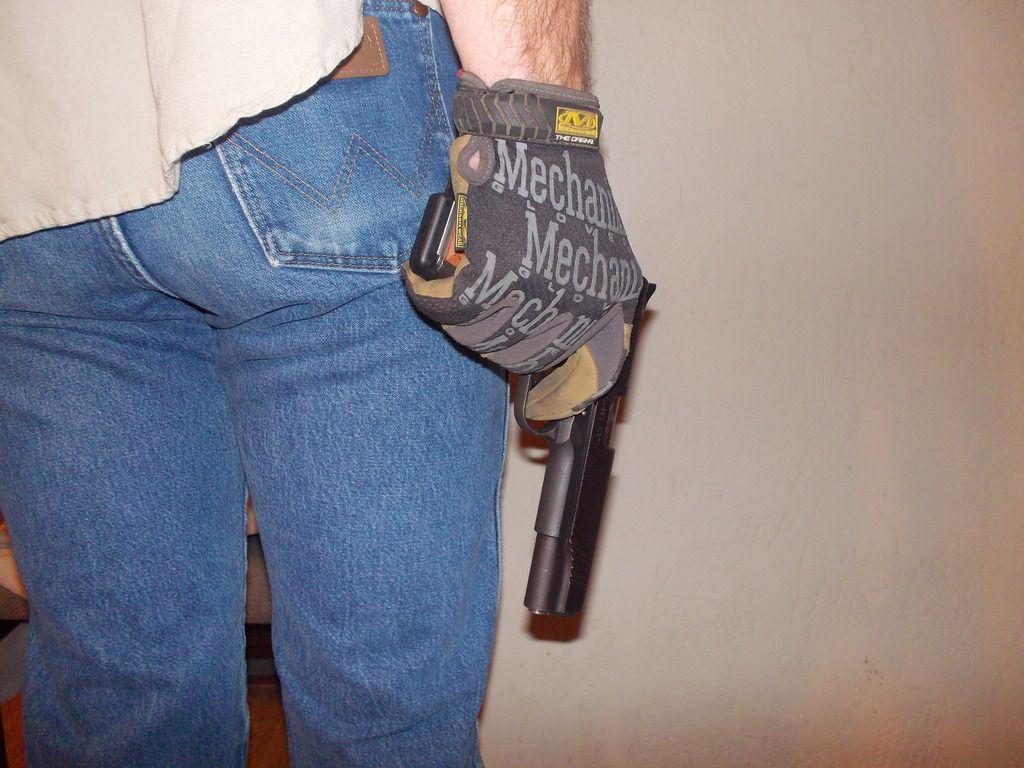
I had my son act as a mannequin for some draft photos.....
Again: These are DRAFT photos. No tripod, minimal effort at background and lighting, dogs in the background, etc. This is just to see if this type of image is workable and desired. 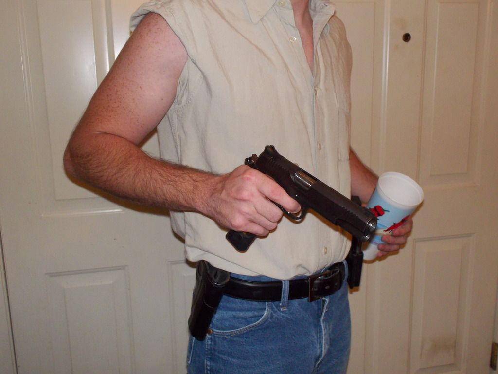
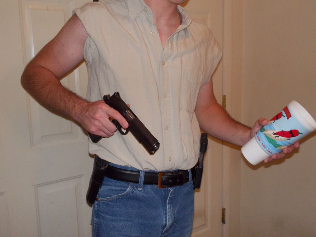
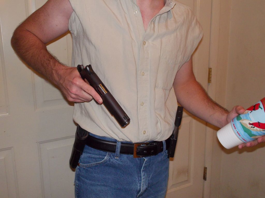
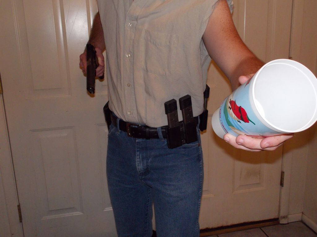
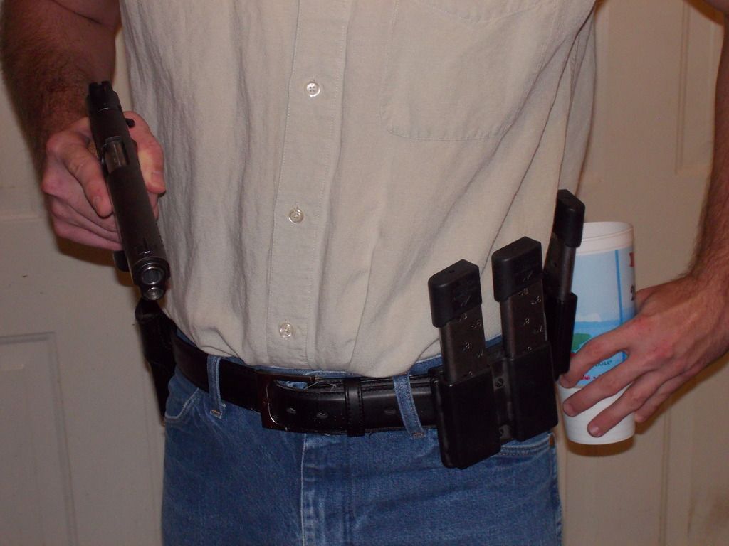
If I'm reading StimpsonJCat correctly, his ideas will make Billy (or Nate, in this case) the central figure of the cover. If more of this type is desired, I can go to Goodwill and pick up a shirt and hang a sheet for a white background. I didn't include Nate's face at this point but it can be done later if desired. I'll also have to pick up a skull face mask. My thought was slightly different...Show our protagonist from behind as he approaches the cantina. Billy/Nate would be to the left of the frame, with the cantina porch in the background. 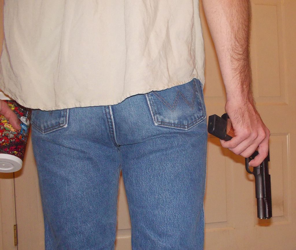
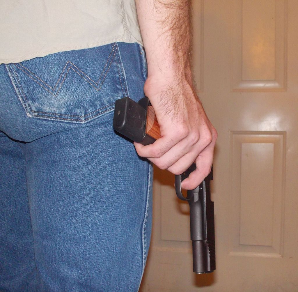
While the 10 round magazine is correct to the story, I'm not sure the the average person browsing Amazon book covers will recognize it for what it is. IMHO a standard magazine would be better. Get rid of the light switch, add a fill light at Billy/Nate's feet to get rid of the muzzle shadow, paint the gloves, drop the cantina porch in as the background......... 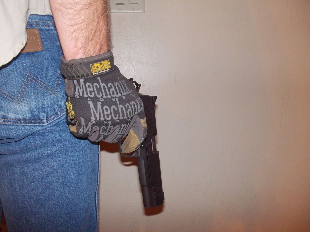
ETA: I really need to clean up that spot on the wall where my dog sleeps by the front door. |
|
|
|
[#45]
Holy Smokes Kermit!!!! --thinking--and a prompt of how to mix the familiar/known genre trope with story specific element-- that last shot(s) from behind with glove--same shot, pro mixed/colorized/fiddled, 1911 and skeleton glove. Would definitely work. Jeez Kermit. Just outstanding. Ok, The Witching Hour. Need to polish and actual update--DEADLINE APPROACHING. And back to work. |
|
|
|
|
[#46]
just remember - you are making a cover to sell a book. the symbolism/allegory will not appeal to those unfamiliar with the story...
I am not saying you need the kid exiting the flaming cantina carrying a belt fed but maybe...action...
|
|
|
|
|
[#47]
You guys are killing me. I see the thread bumped many times lately. I am like sweet a update. Nope working on cover art. You guys are doing are great job helping DC.
Still awaiting the release. DC keep it up. |
|
|
|
|
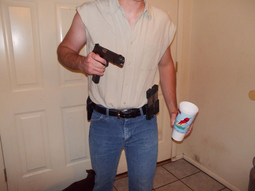
[Last Edit: stimpsonjcat]
[#48]
I agree, the last pic is a good candidate.
Get some black gloves and do the bone treatment like DC did earlier and I'll be glad to mono it. Finger off the trigger please. Nice job on the lighting by the way! Hey Zoe, this is not an update!
|
|
|
|
AZ, USA
|
[#49]
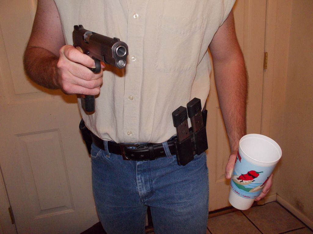
Some of the pics have the trigger finger indexed along the slide, others don't. That was on purpose. Keep the self-selection thing in mind....to us, finger on the trigger screams SAFETY VIOLATION, but to the casual Amazon cover browser it looks "normal".
Let's let DCB make the call there.... |
|
|
AZ, USA
|
[Last Edit: kermit]
[#50]
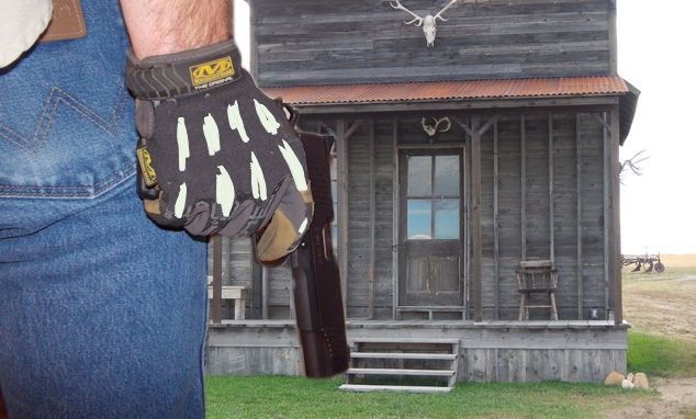
Test photoshop while I ate lunch...just to explore the idea |
|
|
 Win a FREE Membership!
Sign up for the ARFCOM weekly newsletter and be entered to win a free ARFCOM membership. One new winner* is announced every week!
You will receive an email every Friday morning featuring the latest chatter from the hottest topics, breaking news surrounding legislation, as well as exclusive deals only available to ARFCOM email subscribers.

AR15.COM is the world's largest firearm community and is a gathering place for firearm enthusiasts of all types.
From hunters and military members, to competition shooters and general firearm enthusiasts, we welcome anyone who values and respects the way of the firearm.

Subscribe to our monthly Newsletter to receive firearm news, product discounts from your favorite Industry Partners, and more.
Copyright © 1996-2024 AR15.COM LLC. All Rights Reserved.
Any use of this content without express written consent is prohibited.
AR15.Com reserves the right to overwrite or replace any affiliate, commercial, or monetizable links, posted by users, with our own.